UX/UI Designer
3 weeks
Consultation
The Richmond Hill Group of Artists (RHGA) was founded in 1978 with just 10 members, and opened the Mill Pond Gallery in 1994 with a goal of providing an open and supportive creative environment for artists of all levels. The group hosts a number of events, classes, and workshops, and serves as an open space for its members to socialize and practice their craft.
My primary goals for this project were to refresh RHGA's brand and reorganize the content of its website to be more pleasing and accessible to members and visitors. Because users of the site have a varying level of comfort with technology, it needed to have clear labeling and layout.

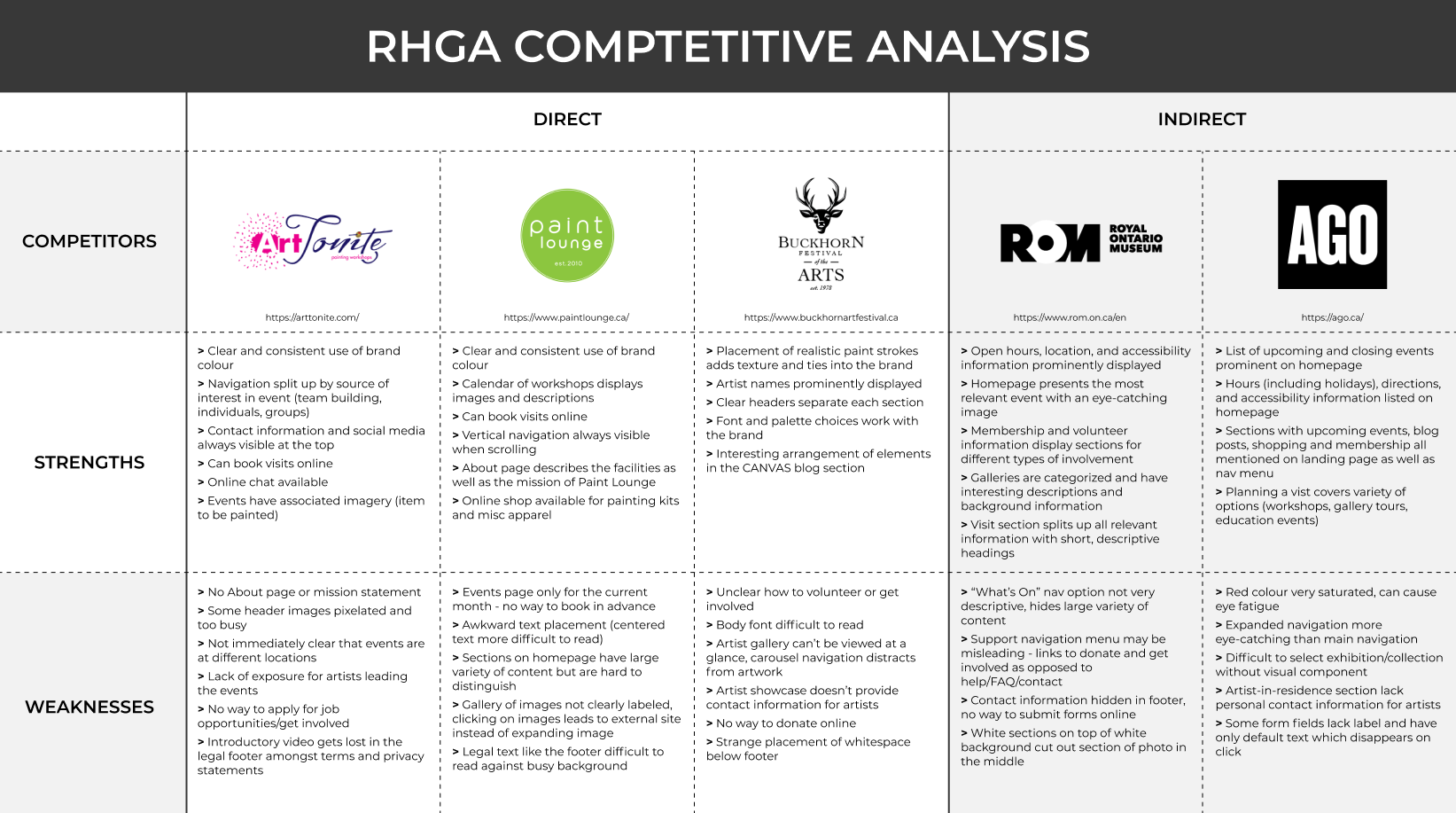
Before diving into primary research, I decided to take a look at RHGA’s direct and indirect competitors. I focused on small art-based businesses as well as larger galleries to get a sense of how they promoted their events, content organization, and their overall strengths and weaknesses.
After speaking to members of the RHGA, I began the project with the knowledge that word-of-mouth and passerby were the main ways the Group was discovered. I was curious to see how people outside of Richmond Hill found out about their local events and any roadblocks that prevent them from participating in their community. To get a wide range of responses, I created a survey that was split into two distinct sections: those who participate in local events, and those who do not.
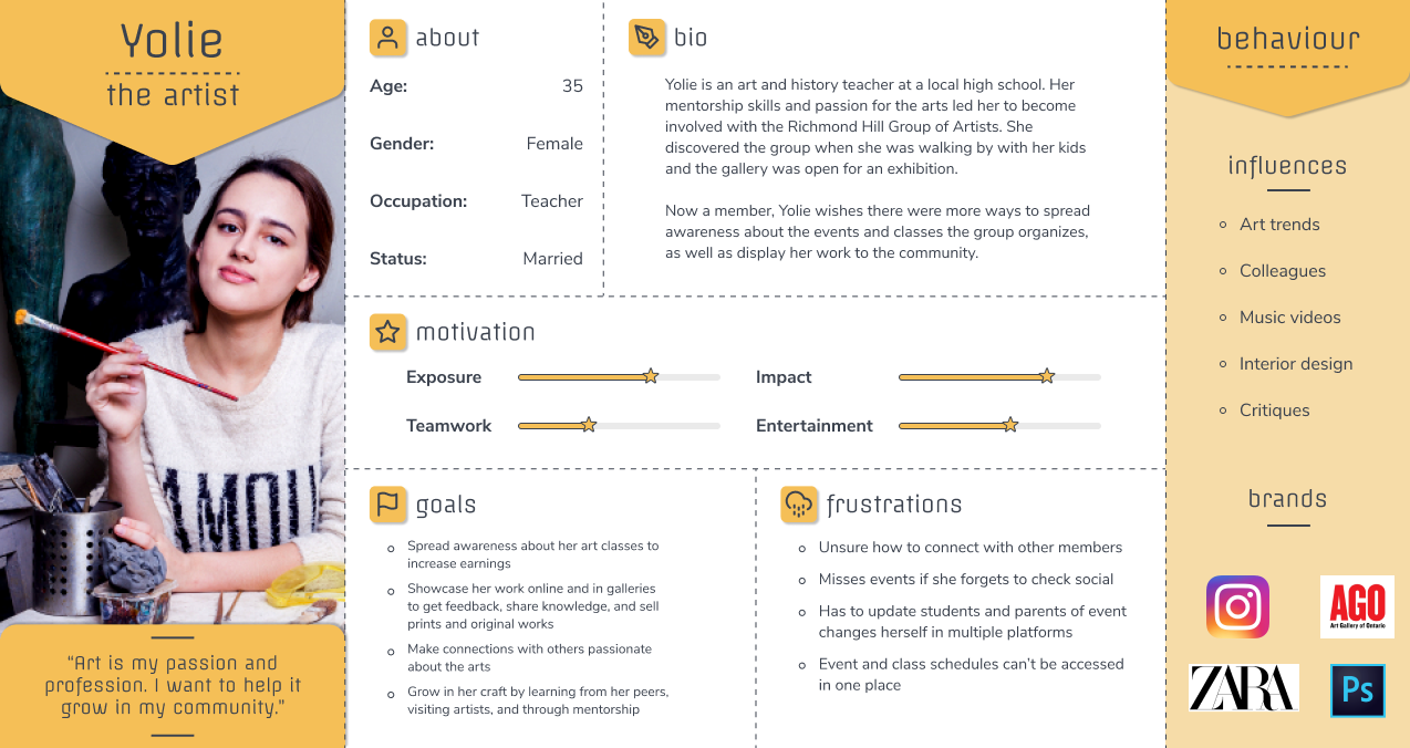
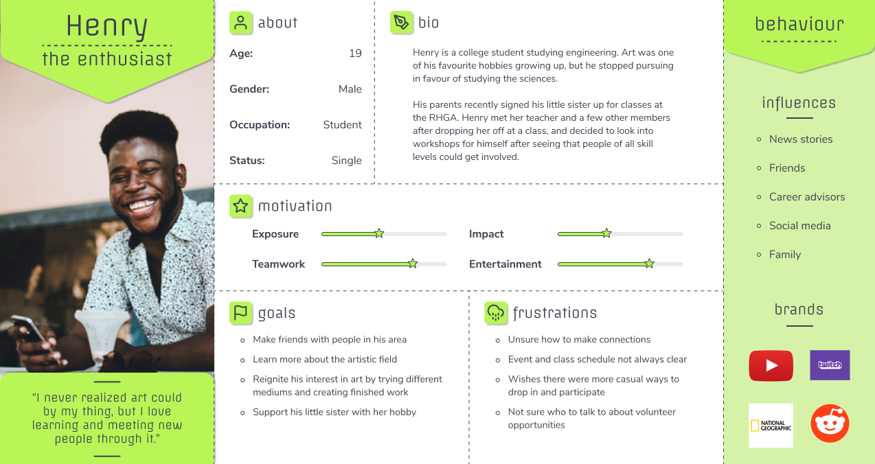
My interviews were focused on 3 main personas: those who weren’t familiar with RHGA, those who were and attended events or classes there, and RHGA members. Interviewing those outside of RHGA was important for understanding how users find and participate in a variety of event types, giving me insights I may not have found if I had only focused on the artistic field.

of users stated that location information is vital to find on an event site.
of users who do not participate in events cited lack of time and being unsure of what to expect as the main reasons for not attending.

of users find out about events through social media, with word-of-mouth and community websites as the secondary sources.

of users who participate in events do so once or twice a month.
"I think if I had more time to search for events that interest me, I would be more open to going. The process of searching is a little overwhelming sometimes."
Positive and supportive environment is vital to gain and retain members and visitors.
Being able to submit forms and RSVP online reduces cognitive load.
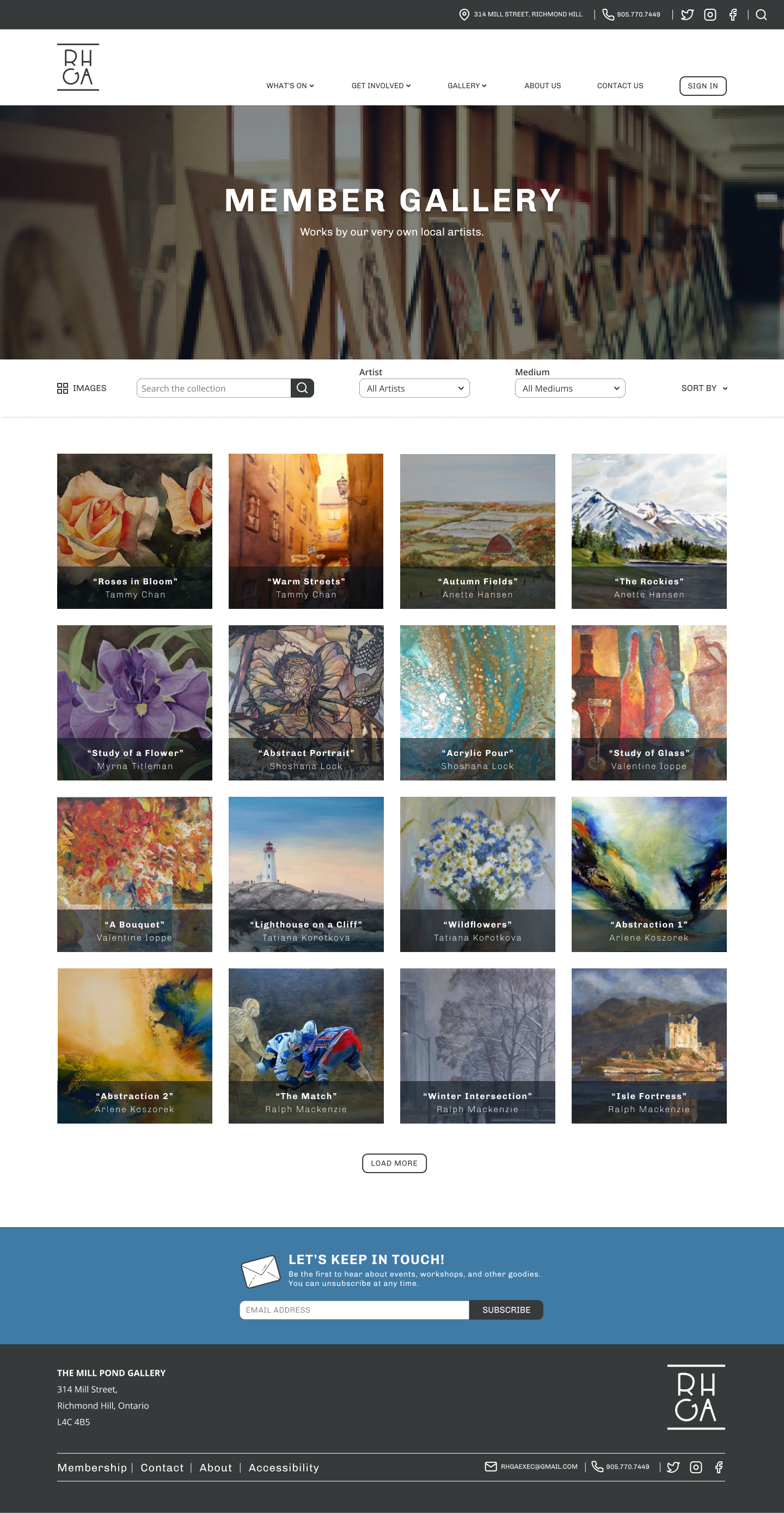
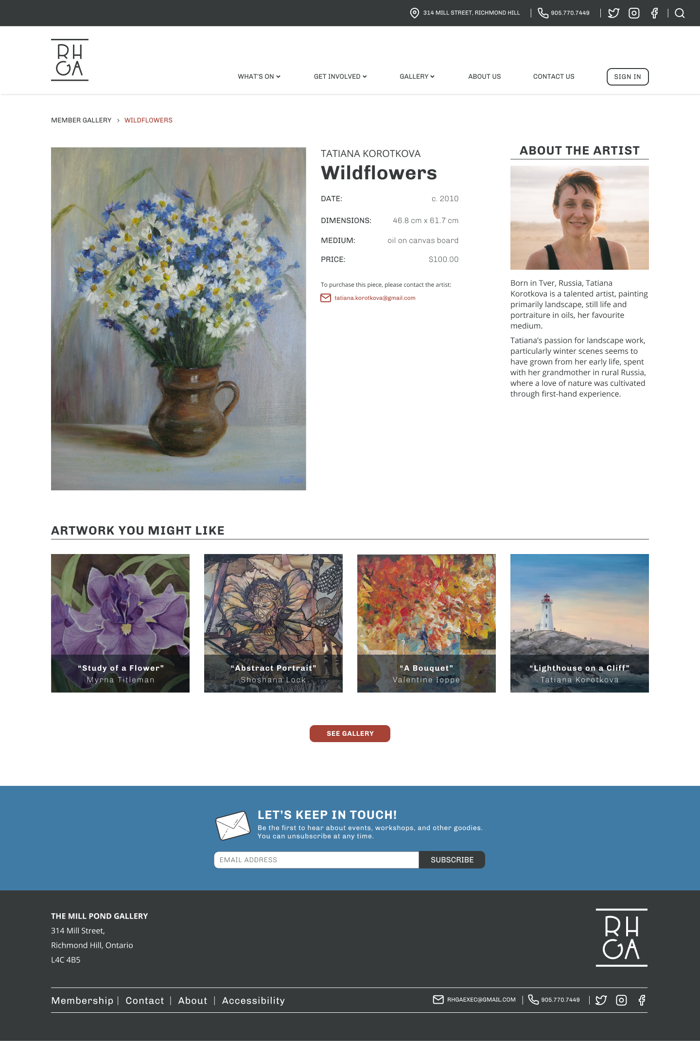
Members enjoy the credibility that being part of RHGA offers, as well as the ability to promote their own artwork and classes.
Free and discounted events as well as food and drink are excellent ways to attract visitors.
A newsletter allows interested parties to receive updates without having to visit the website themselves.
Lack of programs of interest in the area.
Unsupportive participants, instructors, organizers.
Unable to register for events or renew memberships online.
Have to handle physical forms.
Course schedules are not flexible.

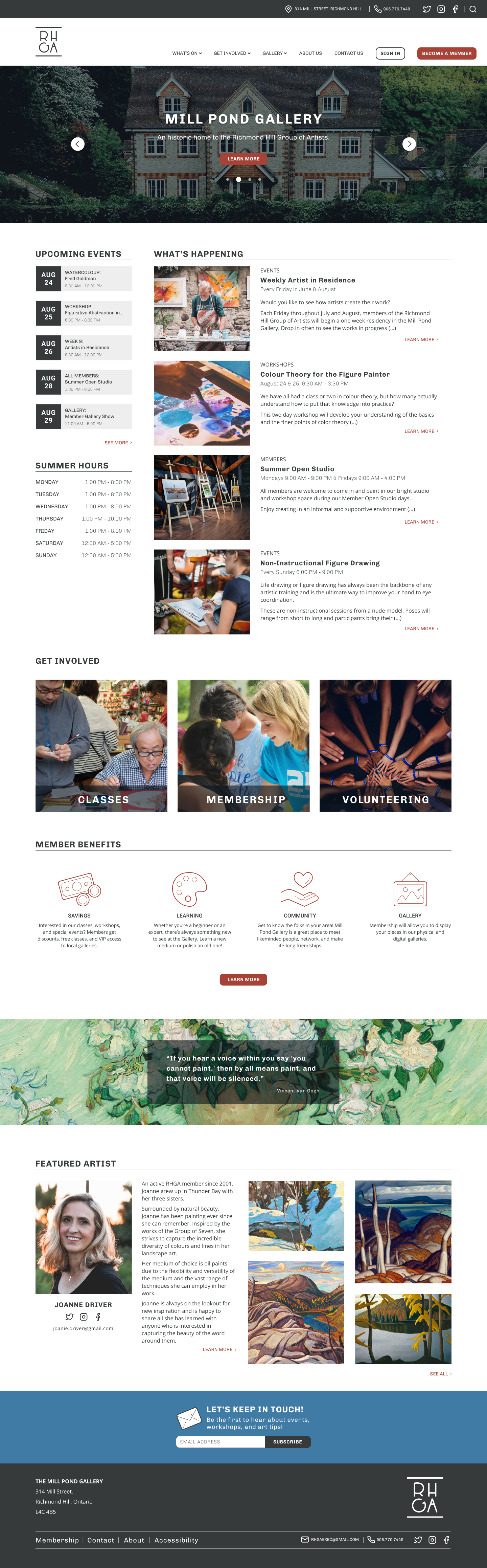
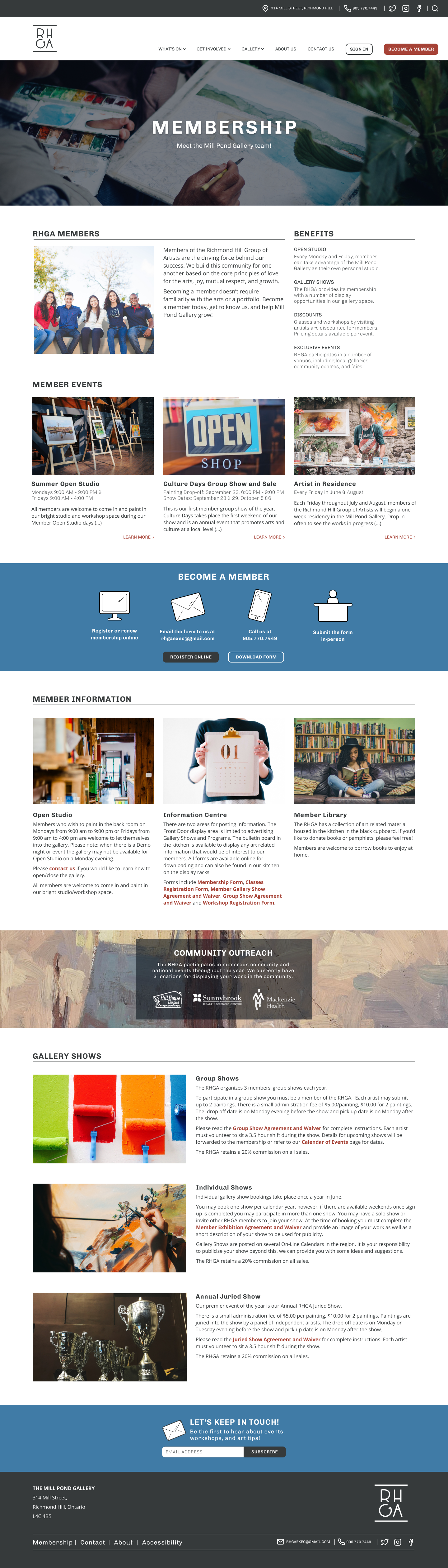
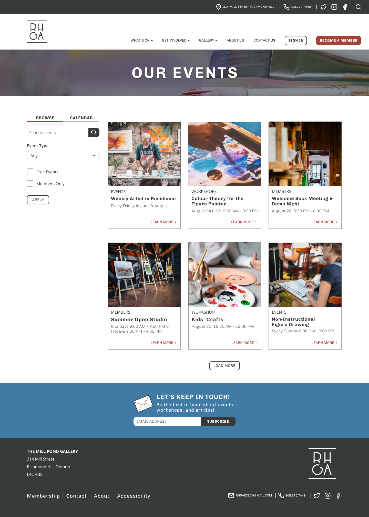
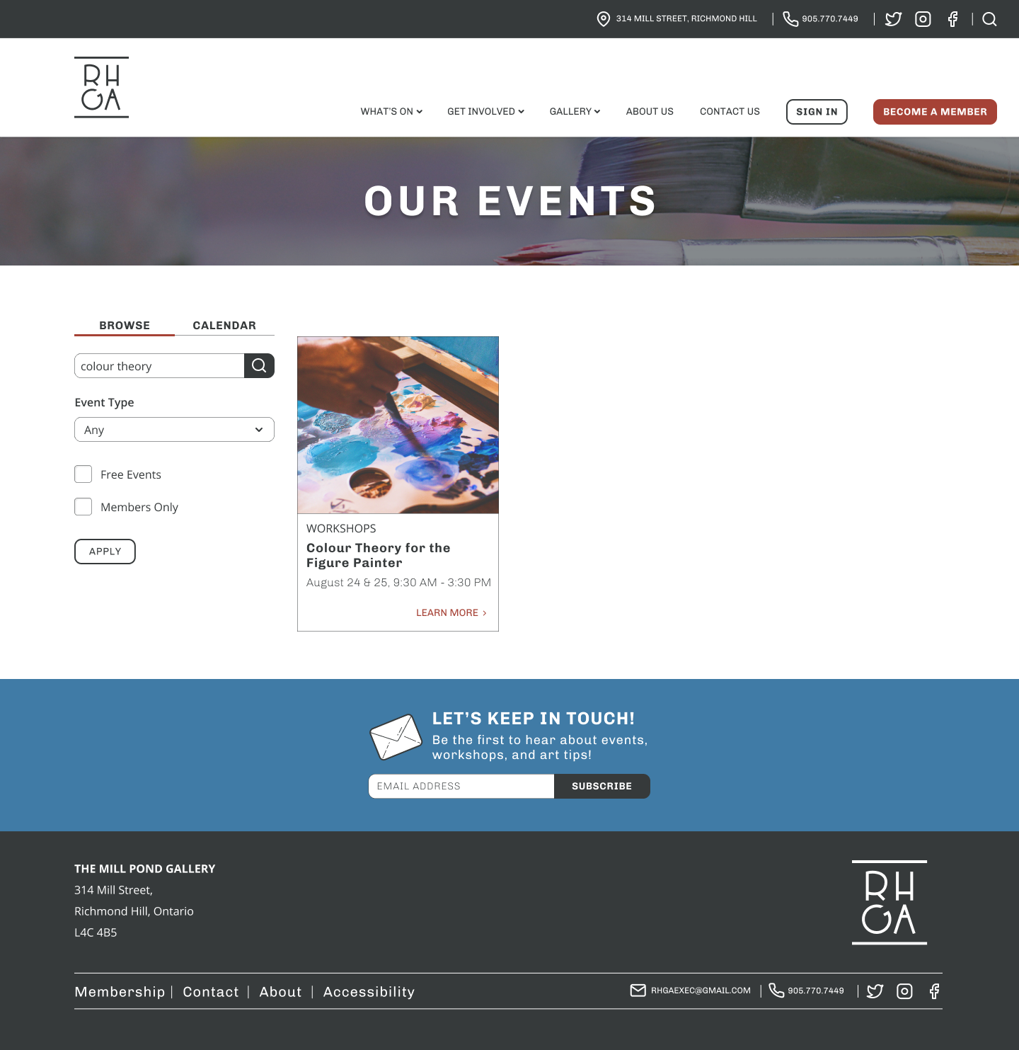
Thanks to my discoveries in the research phase and the original brief, I knew I wanted my design to be clean, friendly, and professional. Since a lot of members and visitors are not as familiar with technology, I needed to make navigation, filtering, and content as straightforward as possible. It was also important that my design didn’t clash with artwork posted to the site.
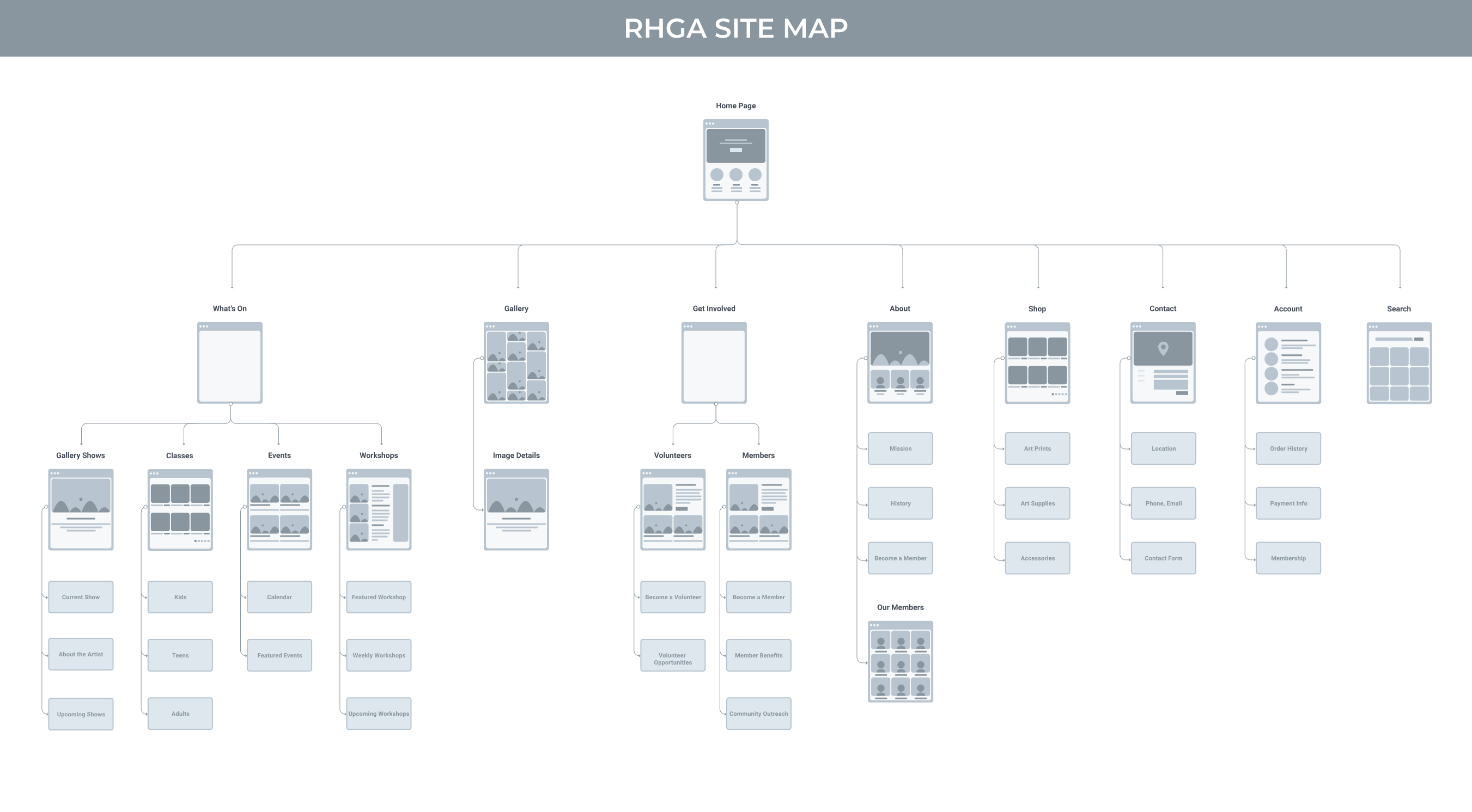
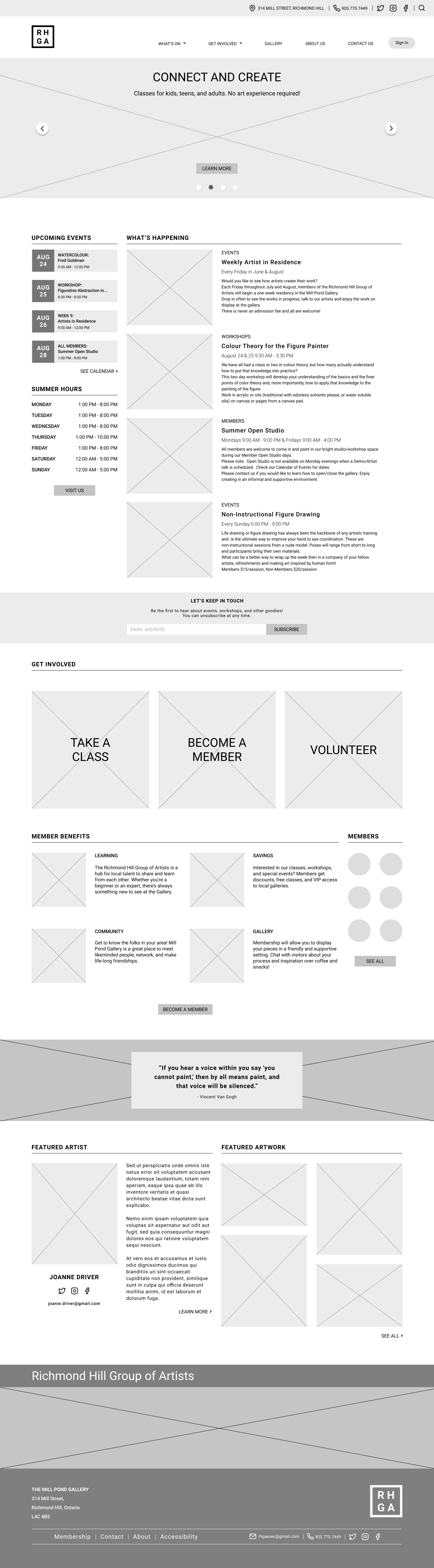
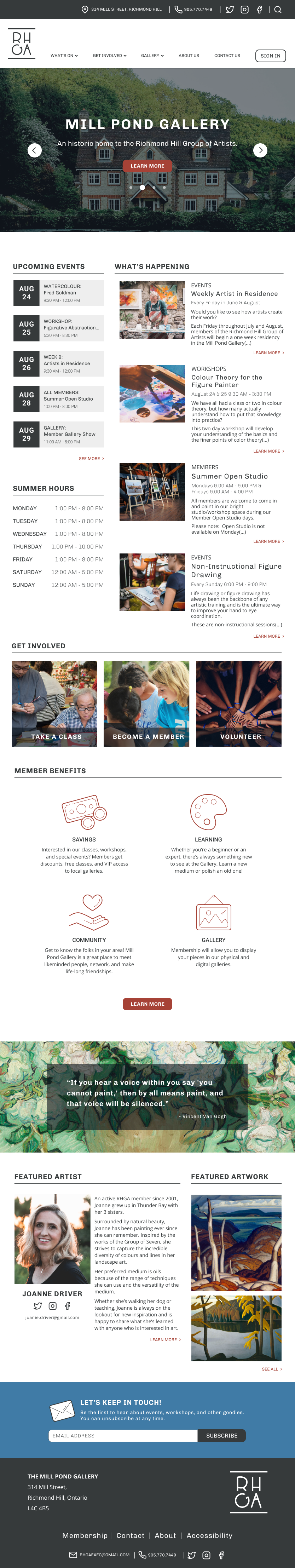
I started with some rough sketches to narrow down the sections I wanted to include on the homepage. Information about events and other ways to participate can assist visitors in finding what they are interested in at a glance.
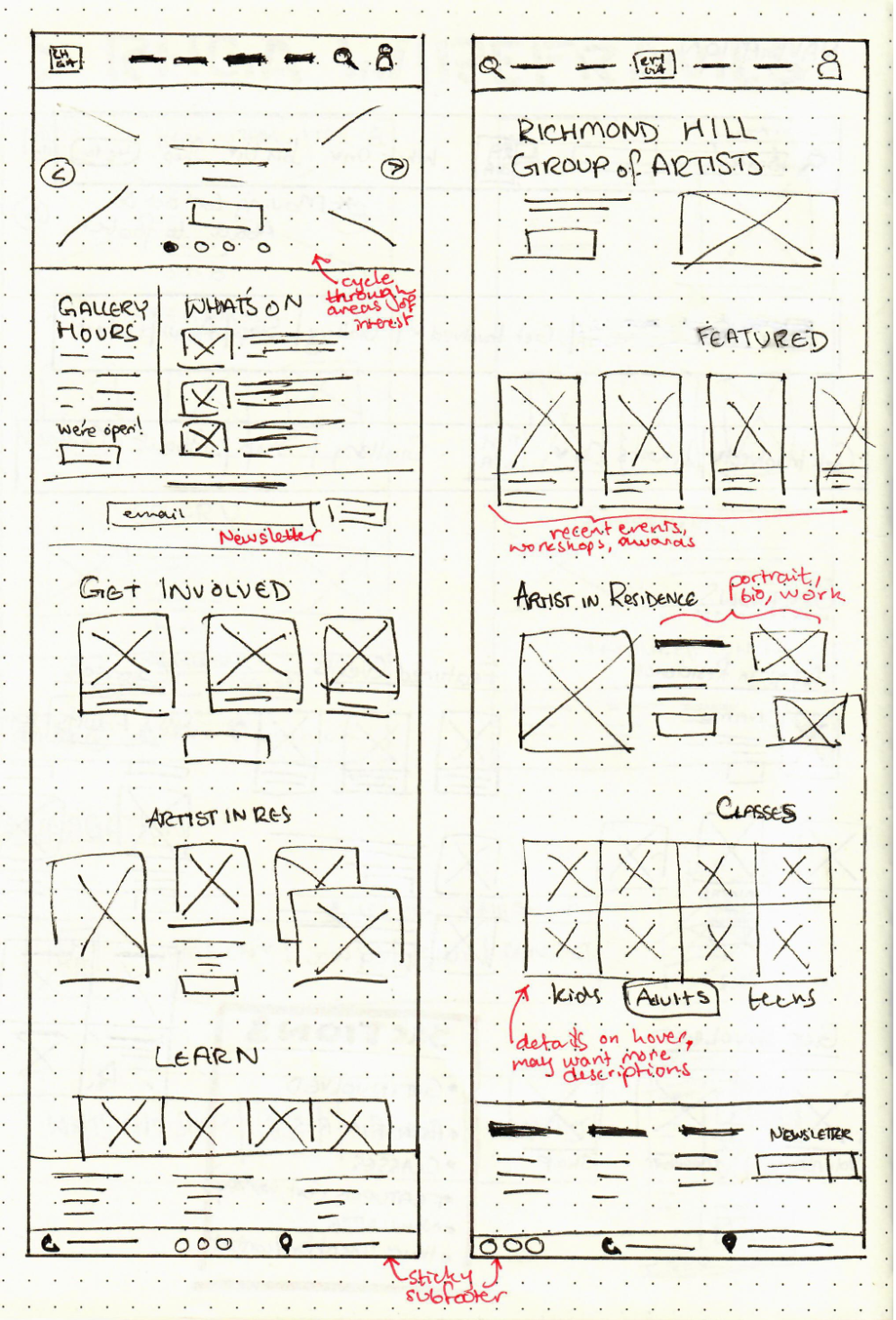
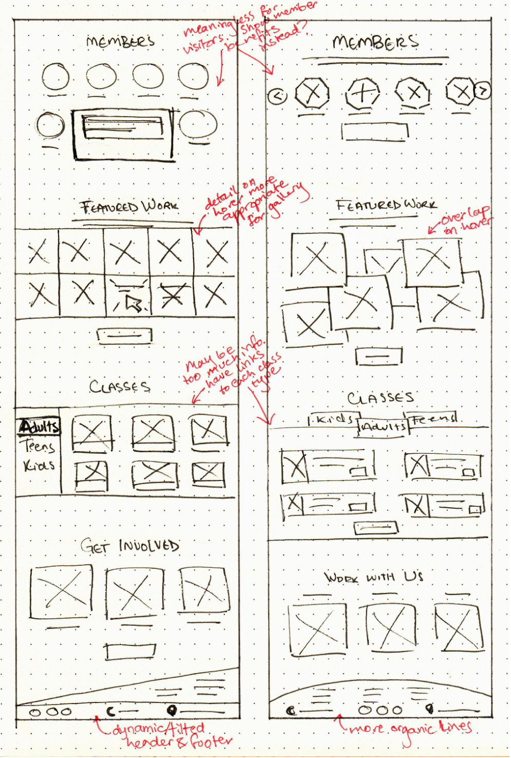
I wanted to include as much relevant information as possible in my initial wireframes. This draft includes multiple areas for members, as exposure is very important for local artists.

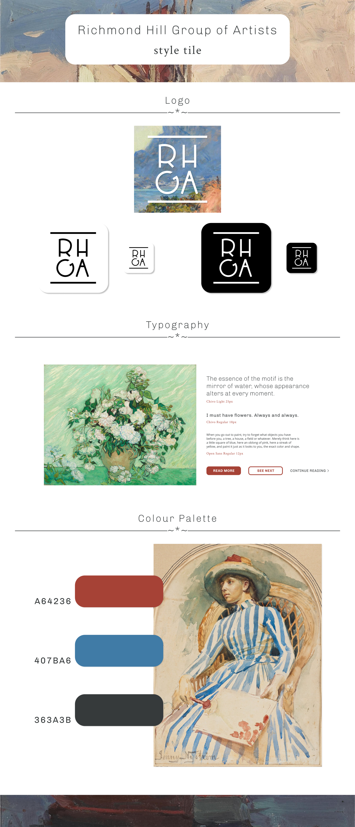
I didn’t want to stray too far from the original RHGA logo, and leaving the Group’s name as an acronym made sense as it would give me a lot of choices with regards to letter arrangement and typography.
The final version of the logo is a relatively simple arrangement of the acronym. I tilted the G slightly to add a bit of visual interest and playfulness, and sandwiched the letters between two lines in order to unify the logo.
I wanted to channel a soothing and artistic aesthetic for the site, and based my palette off of “Portrait of a Lady” by Jenny Nyström. Originally, I tried to use a serif font for the body copy, but it felt less friendly and homey than the sans-serif I ended up going with.

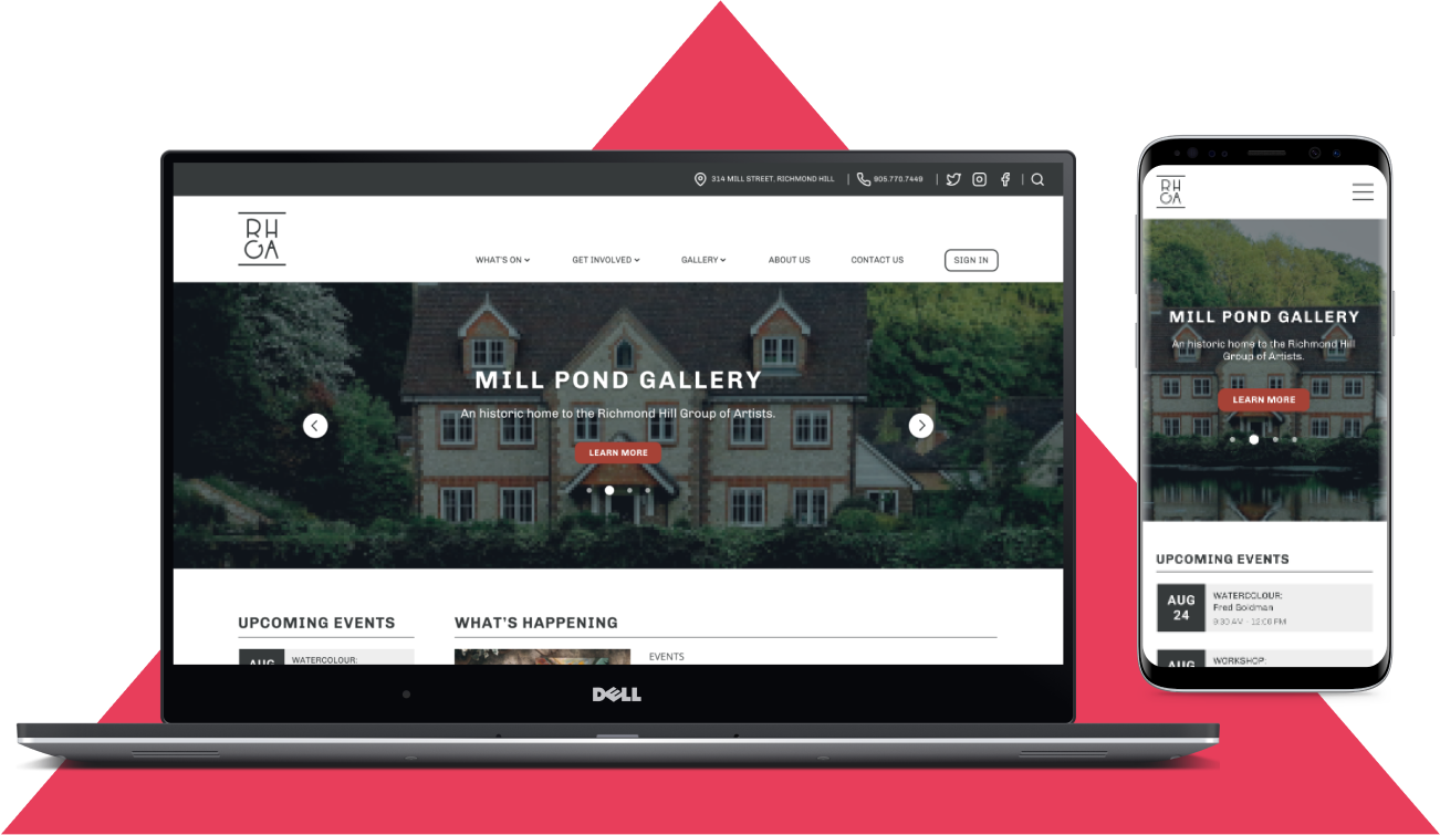
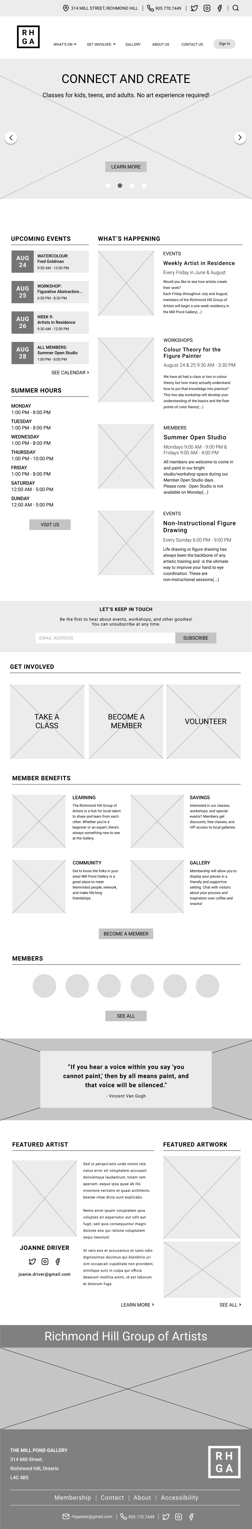
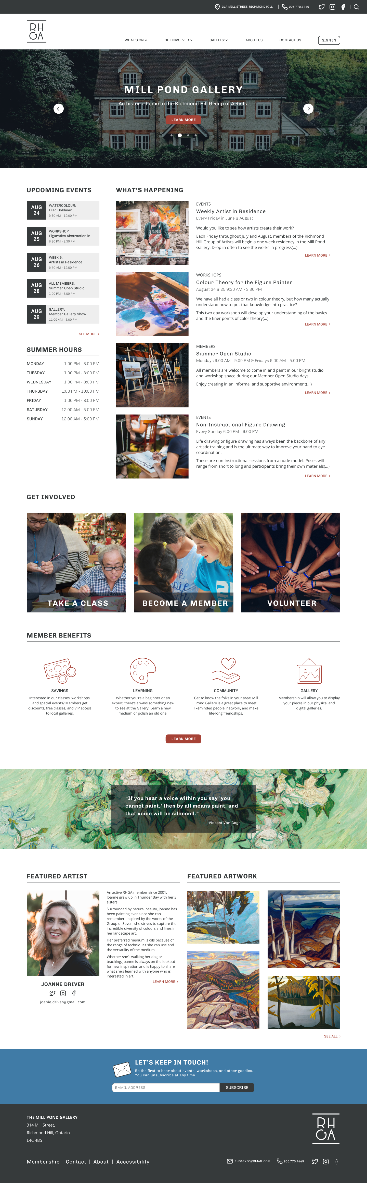
The high-fidelity version of the homepage has a few key differences from the initial wireframes. I ended up removing the Members section since it clashed with the alignment of elements and served no real purpose on a homepage - it made more sense to have it as a subsection of the navigation. I also ended up removing the Visit Us section as the page already had multiple areas where a visitor could find contact and location information.

Now that I had solidified my design, I began to flesh out the content of the site. RHGA relies on events and member engagement, so I wanted to focus on the following in my testing:
During usability testing, I noted any and all comments by my participants. I wanted to know their thoughts about the design direction, imagery, spacing of elements. This feedback was then compiled into a report and affinity map, where I prioritized the changes before implementing them for my final version of the project.
Users were asked to perform the following tasks:
The first task was focused specifically on what users thought about the design and layout of elements.
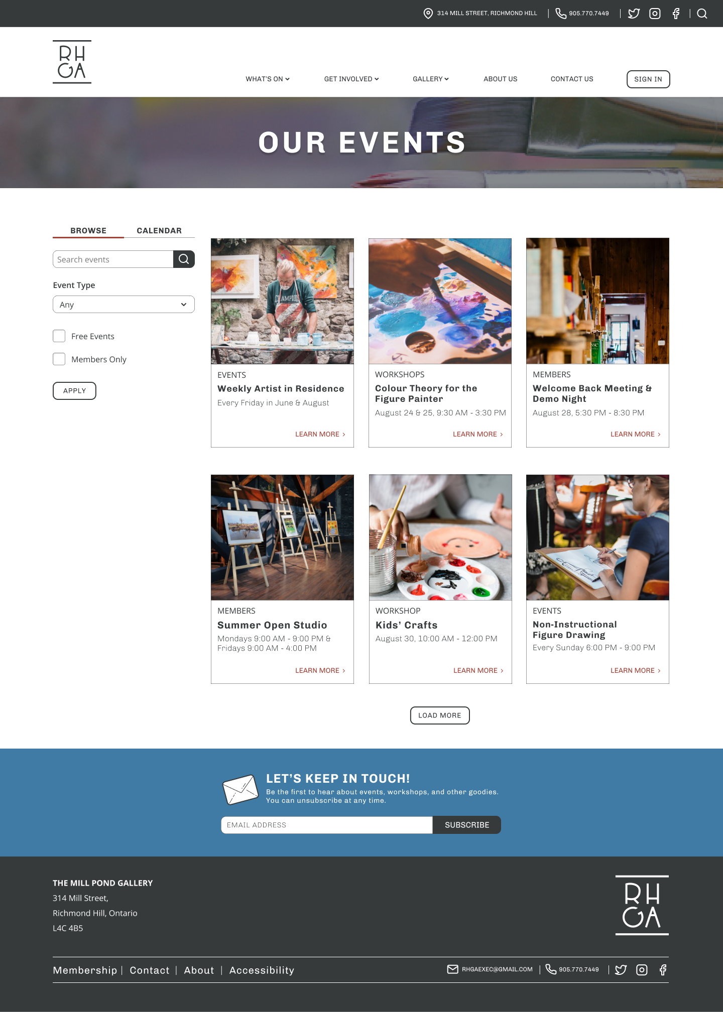
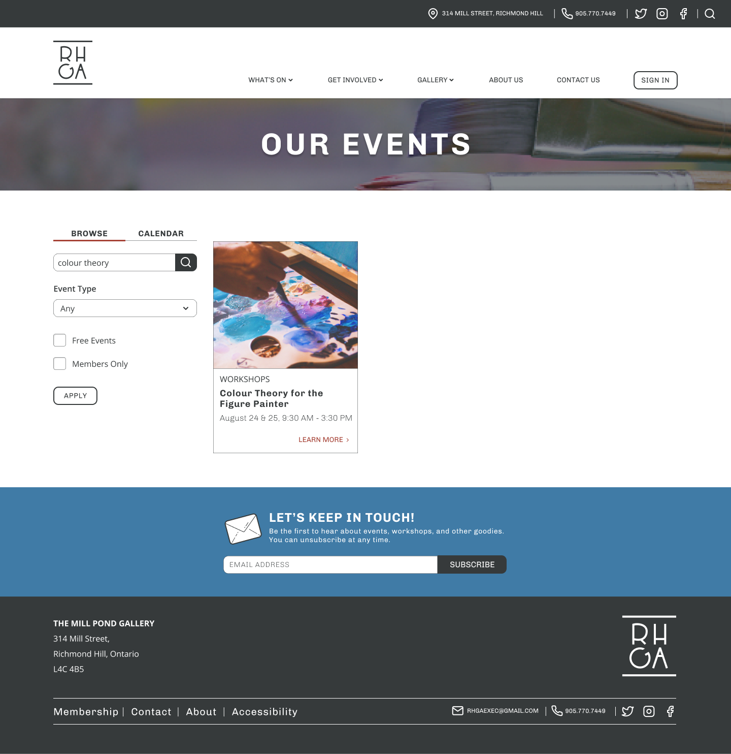
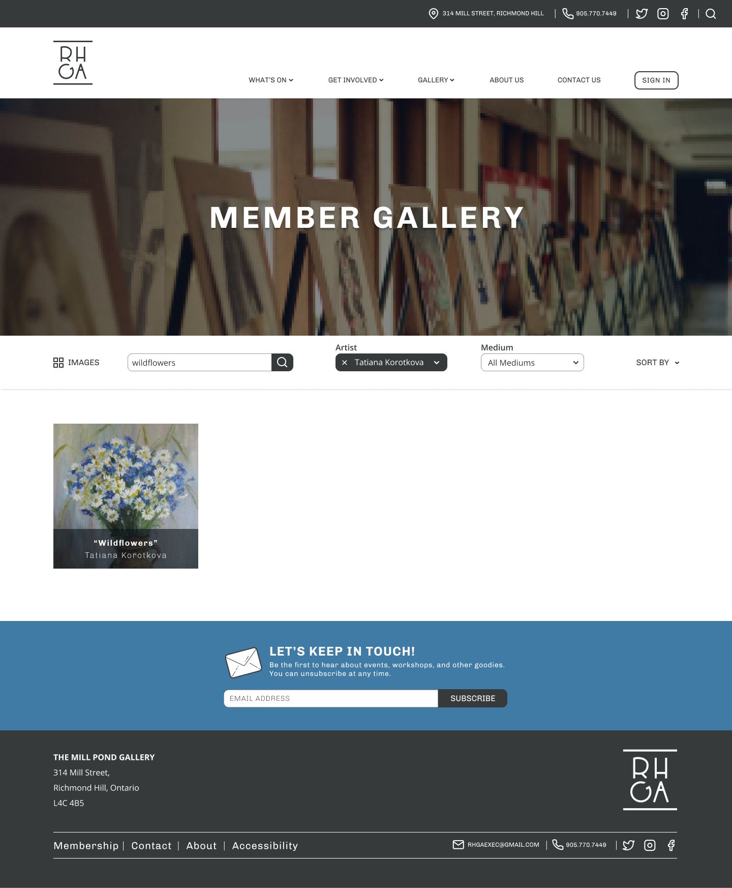
The second and third tasks required the users to navigate to a new portion of the site; I wanted to check if my navigation organization and labeling was effective enough to make this task simple for the user. Filtering and searching were also part of the last two tasks. I wanted to give my testers the ability to try these features and comment on if they found them useful and intuitive.
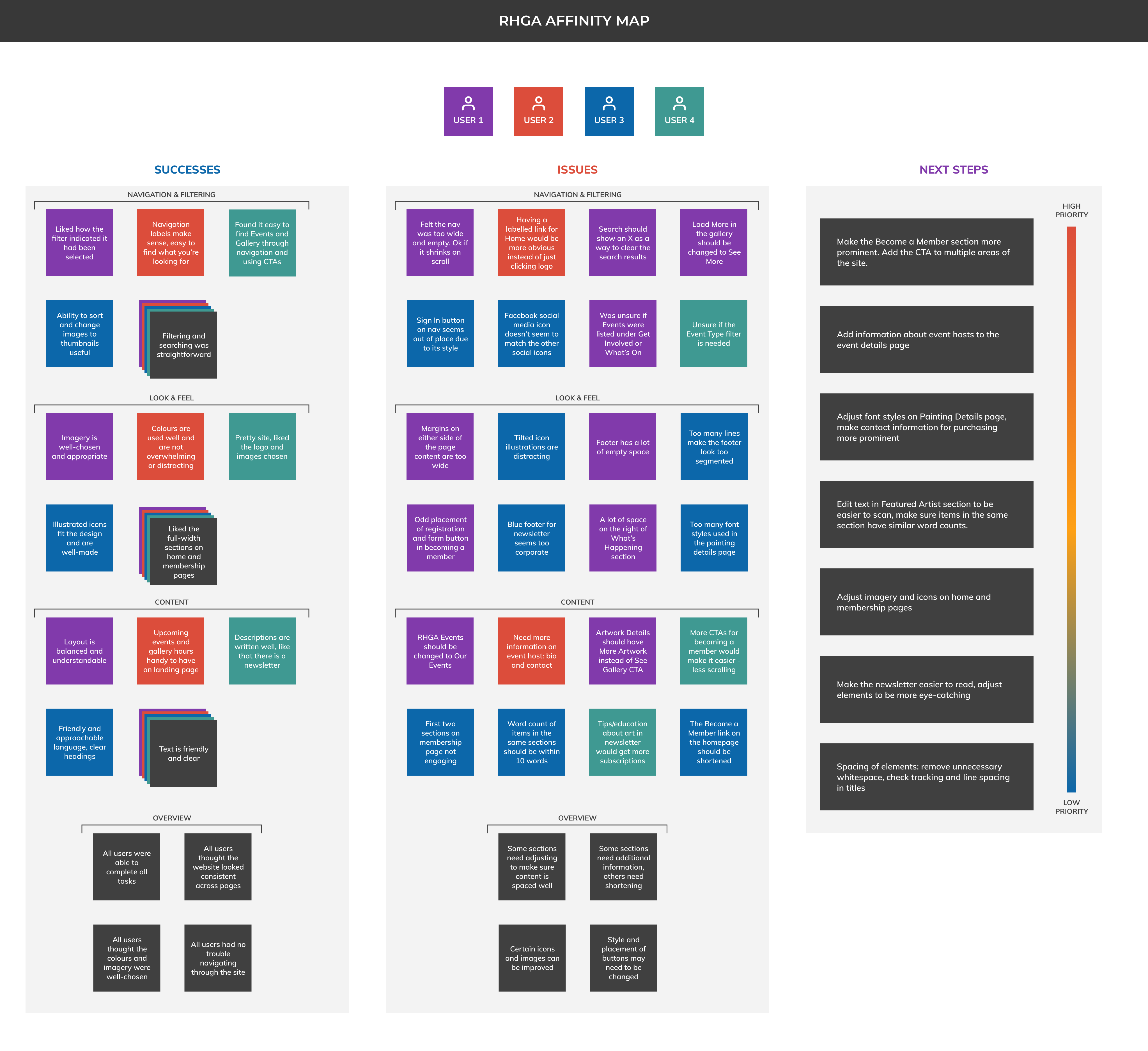
All of the participants were able to complete the tasks quickly, and were happy with the overall design. I also really enjoyed hearing their opinions on the content itself; due to one user’s experience with writing for websites, I was able to clean up the text in quite a few sections.
One user has limited central vision and typically needs to zoom into a web page when browsing. His feedback was very helpful when thinking about spacing of elements; while whitespace is useful in letting the elements on the page breathe, it also makes it harder for him to find his place when zoomed in.
Talking with members and visitors of RHGA was invaluable. Learning what people’s goals are, how they achieve them, and what could be made better helped me make sure that I had a solid base to build my design upon.
After evaluating the results of the usability testing, I updated the prototype with the following:
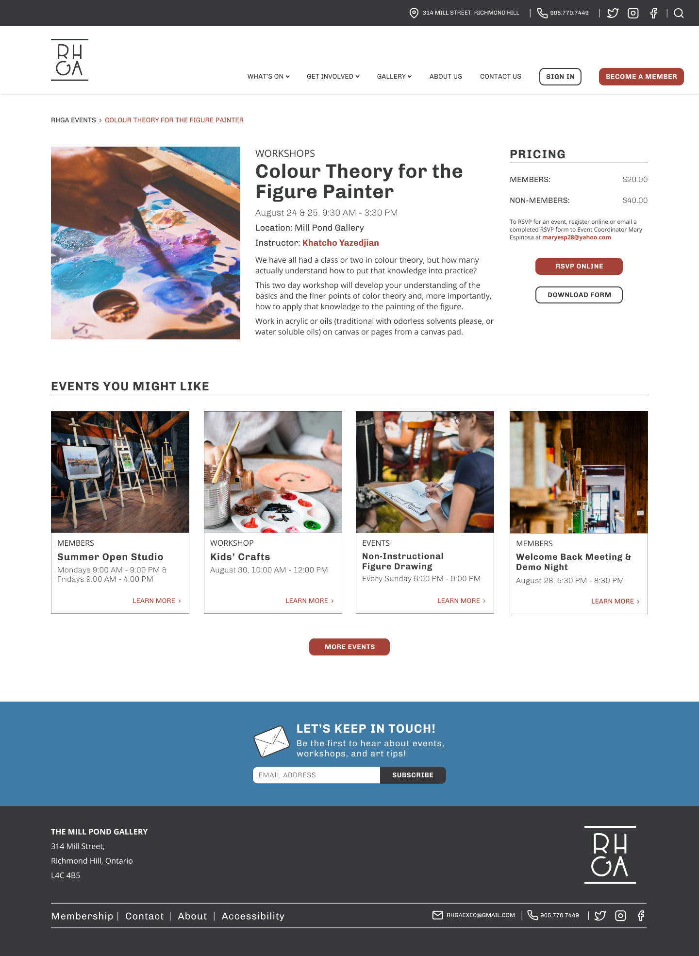
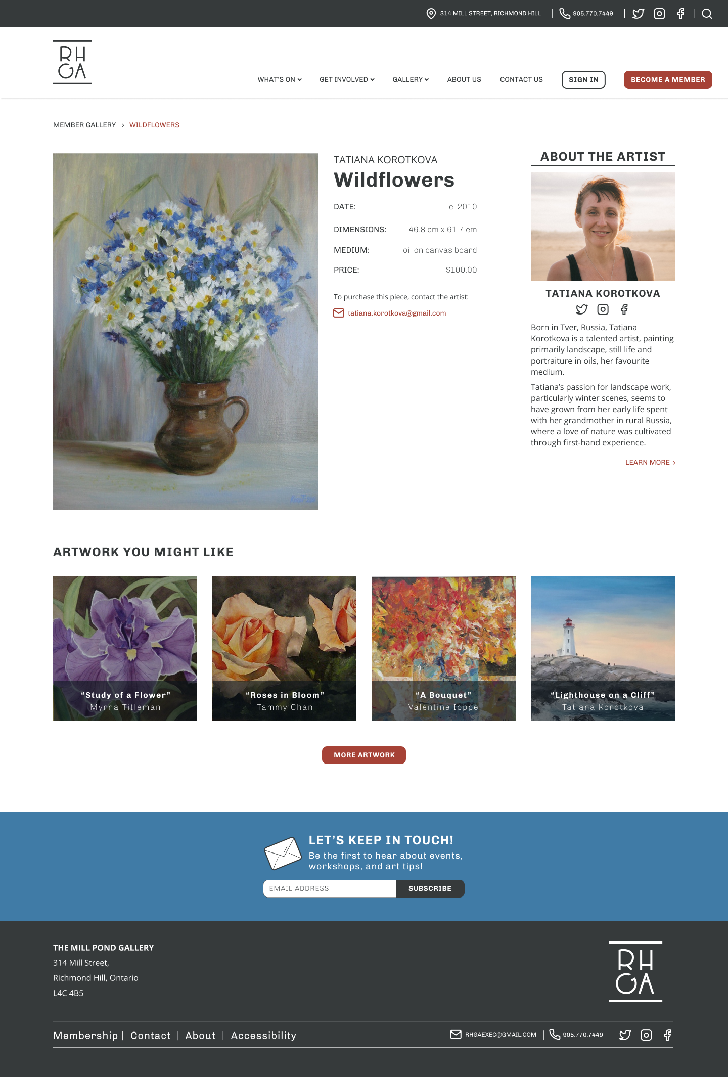
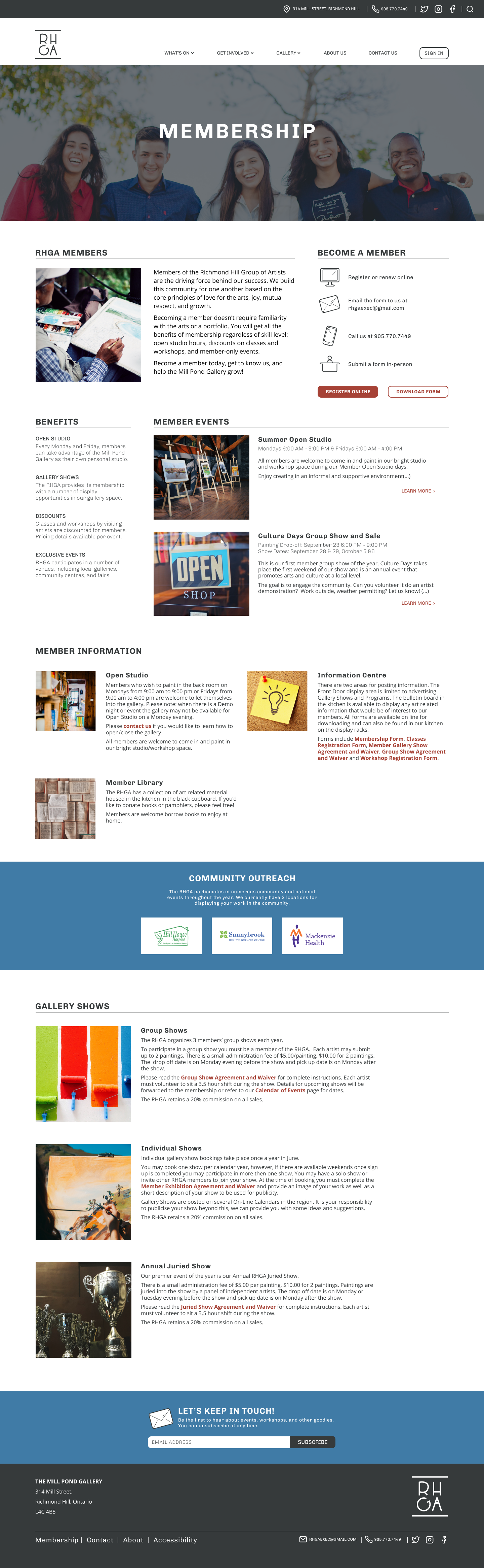
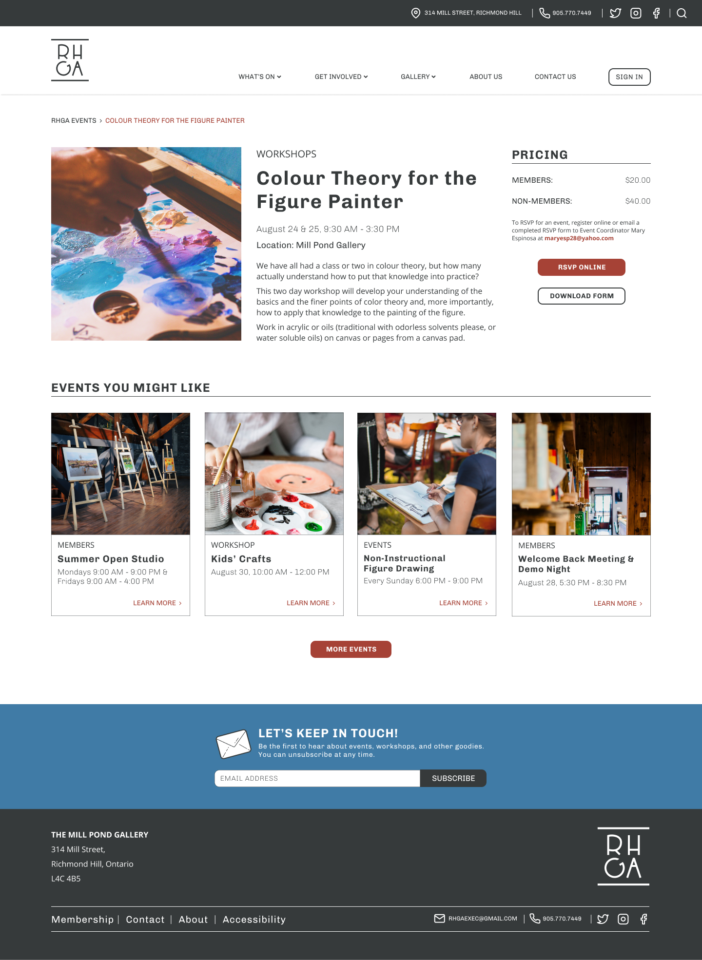
Emphasized elements such as membership registration, event pricing, artist contact information.
Removed unneccessary whitespace, adjusted text size, tracking, and line spacing.
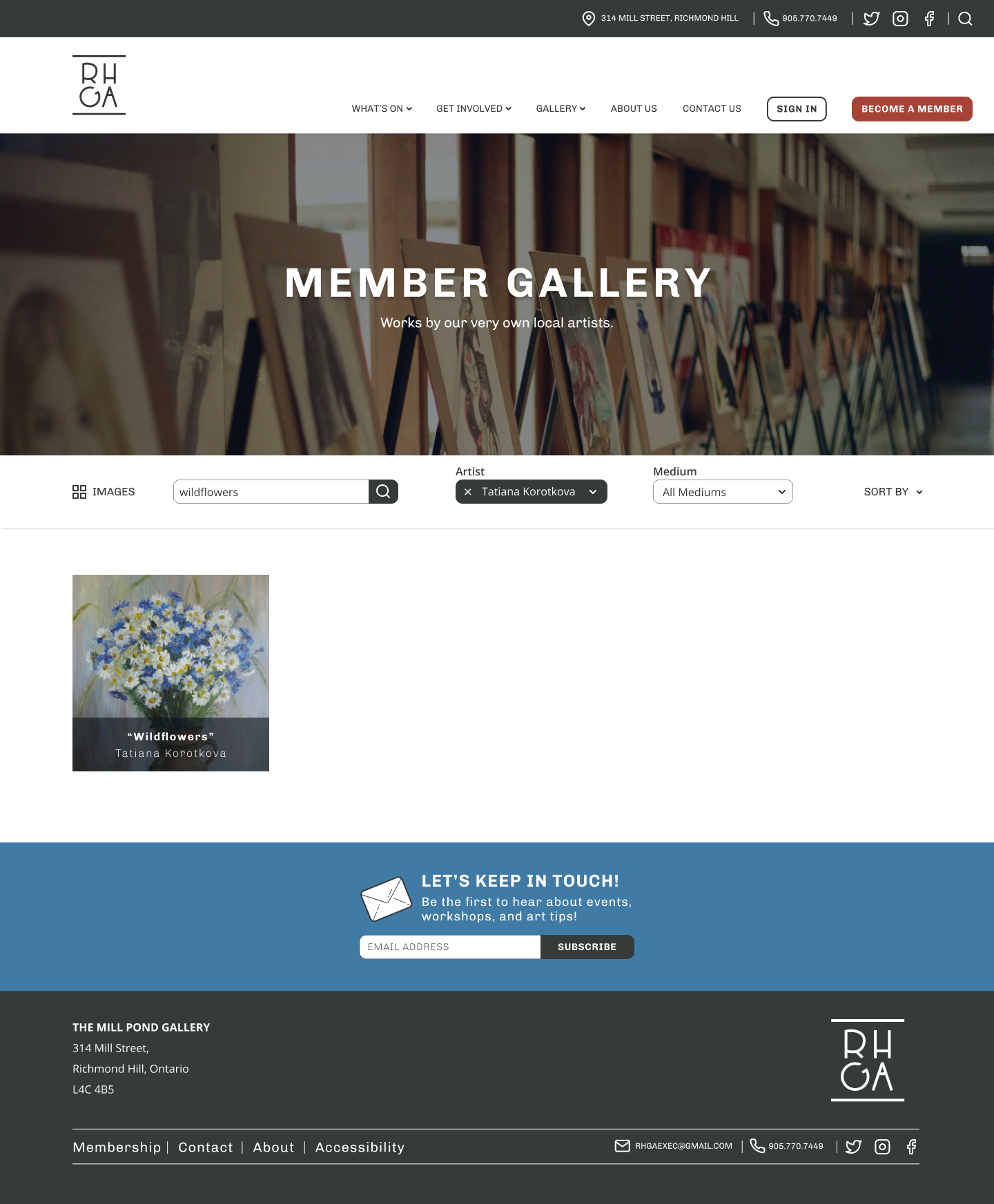
Updated icons and images on the home and membership pages to be more eye-catching and engaging.