UX/UI Designer
2 weeks
Case study
This individual project was guided by a brief: Kaus, a well-established insurance company, is in need of a redesign before they open up the doors to its new e-commerce site.
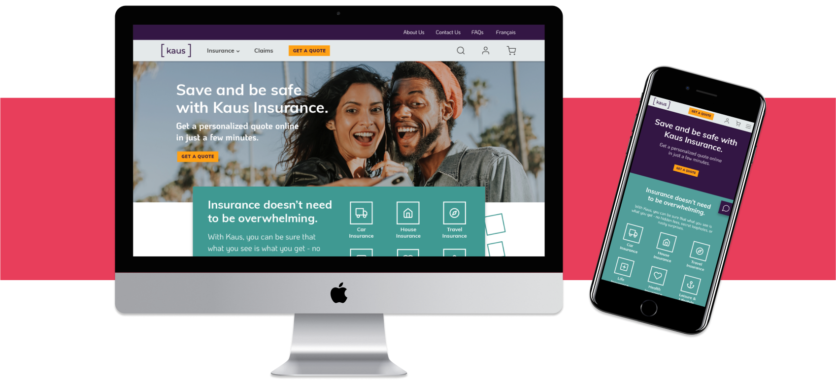
My role in this project was to create a responsive website design which appeals to a younger demographic while also remaining relevant to the existing clientele. The new design needed to be transparent and easy to browse, presenting complex insurance information in as open and straightforward way as possible.
I was also responsible for creating a new logo and brand guide for the company. Kaus had been in a B2B environment for the last 20 years, and wanted to present a trustworthy, modern, and clear brand as it heads into a B2C direction.

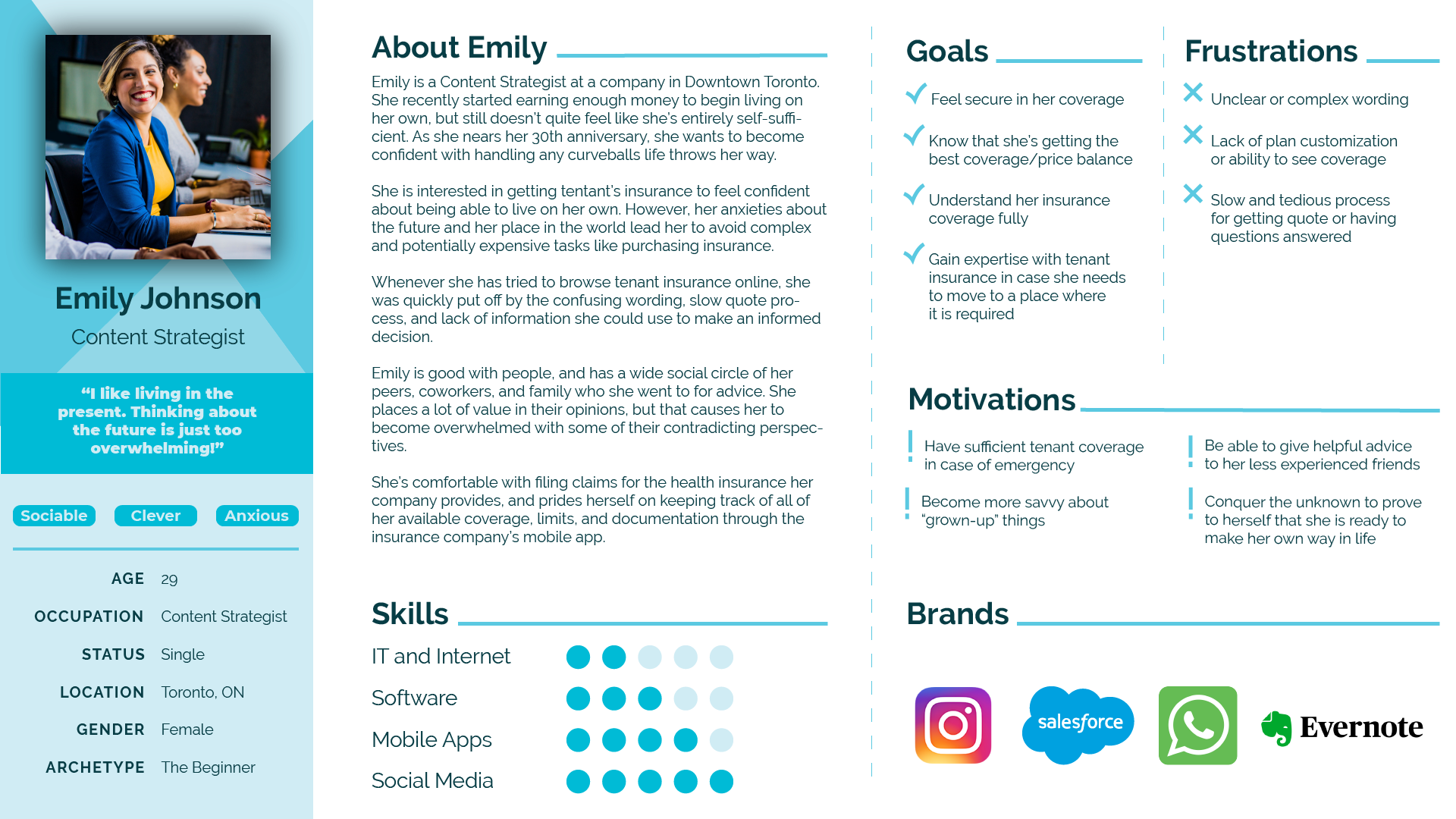
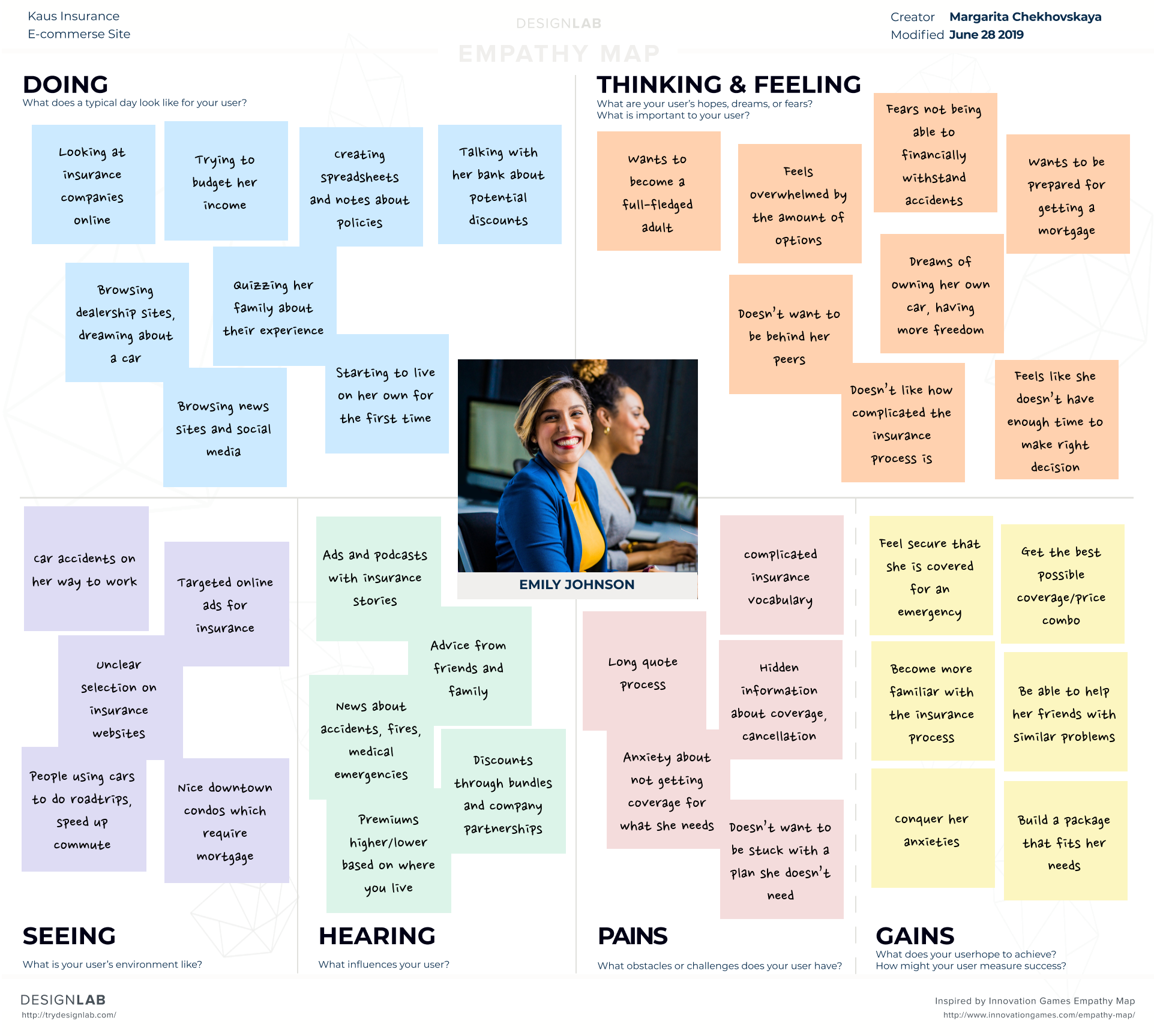
While Kaus knew the policies that it wanted to offer, how users actually approached shopping for insurance online was not well-defined. It was crucial to familiarize myself with the field before starting to ideate. I set out to research general market trends, analyzed competitors' approaches, and set up interviews with users.
Researching the insurance market gave me a lot of insight into the behaviours and preferences of various demographics. As Kaus is a fictional client, the competitive analysis helped me define realistic insurance policies and level of customization.
Interviews are invaluable for a user-centered design approach. I wanted to find out how users are discovering and purchasing insurance plans online, their pain points and goals, and their expectations of a good user experience.
A social media presence and positive reviews are critical to establishing trust.
Large and established insurance companies are more trustworthy.
Clear and simple tone helps users feel more confident that they understand what they’re purchasing.
Friendly, colourful imagery and easy access to navigation is pleasant.
Accessibility should be kept in mind using appropriate colour choices and font size.
Complex insurance jargon.
Personal information used to increase premiums.
Unclear what coverage is included in a policy.
Cumbersome and lengthy quote process.
Overwhelmed by large amounts of data on the page.

Now that I had established the scope of the project, it was time to ideate on the design.
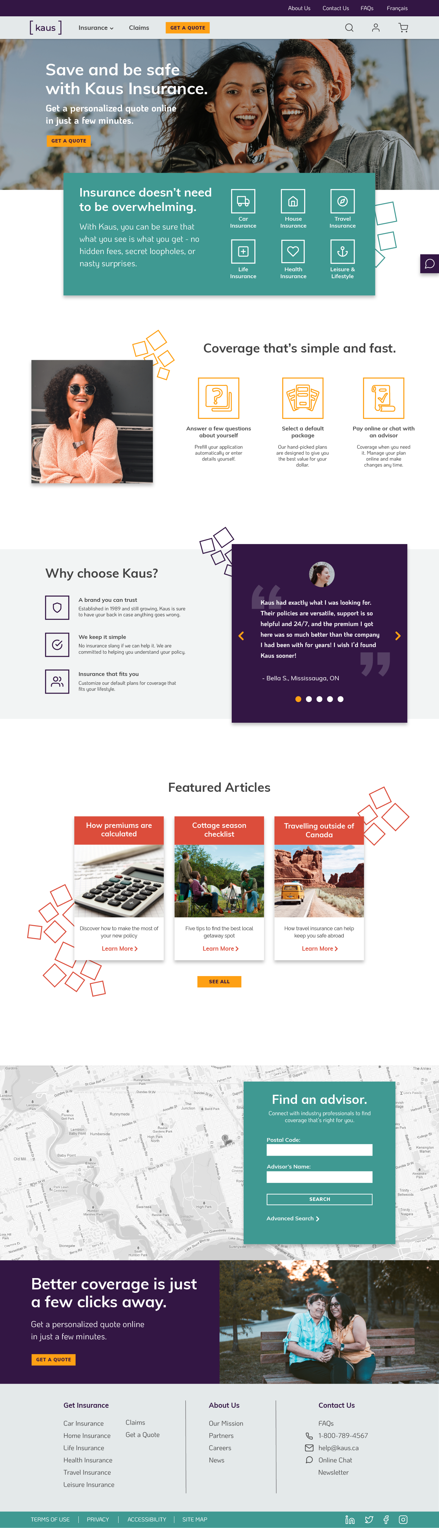
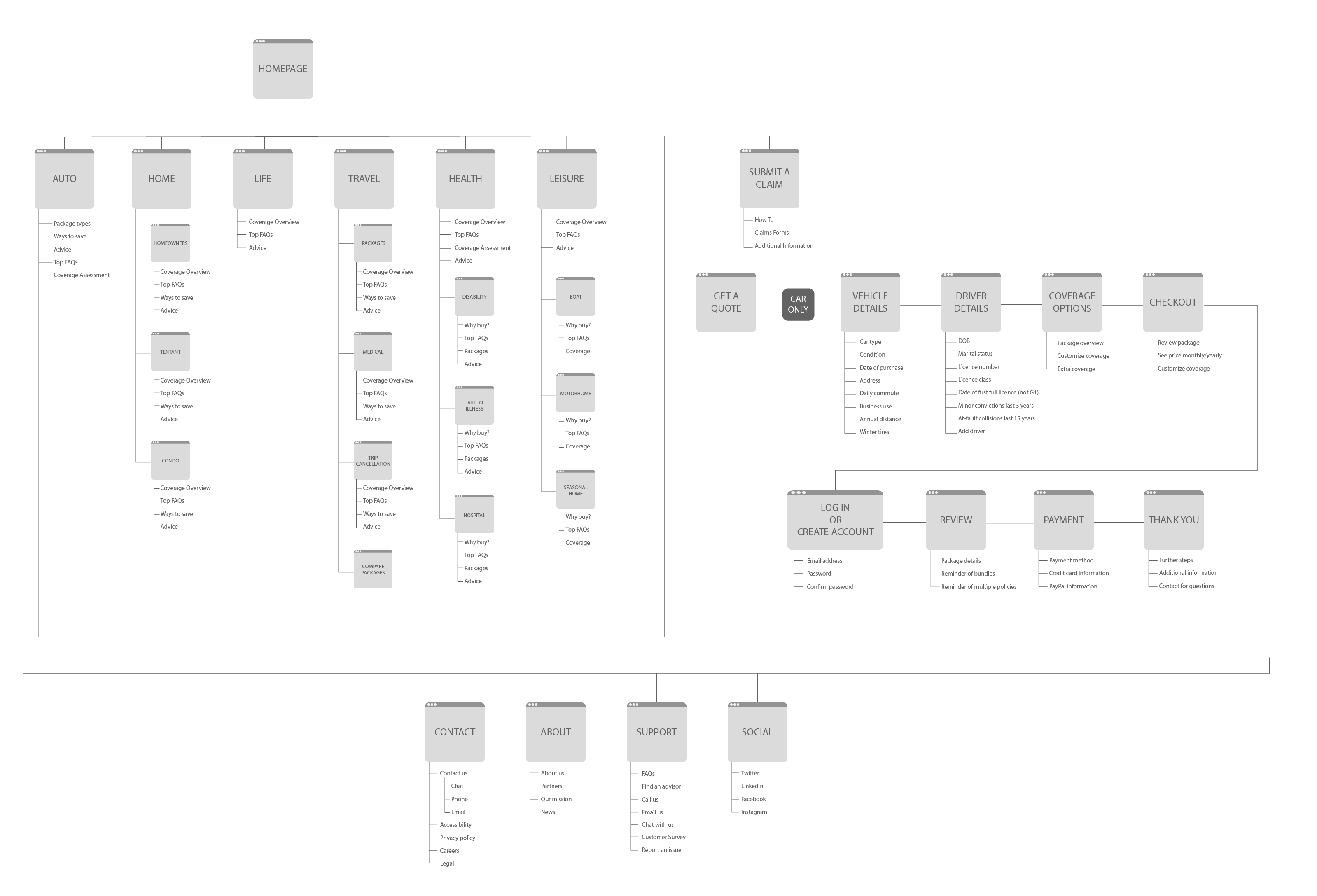
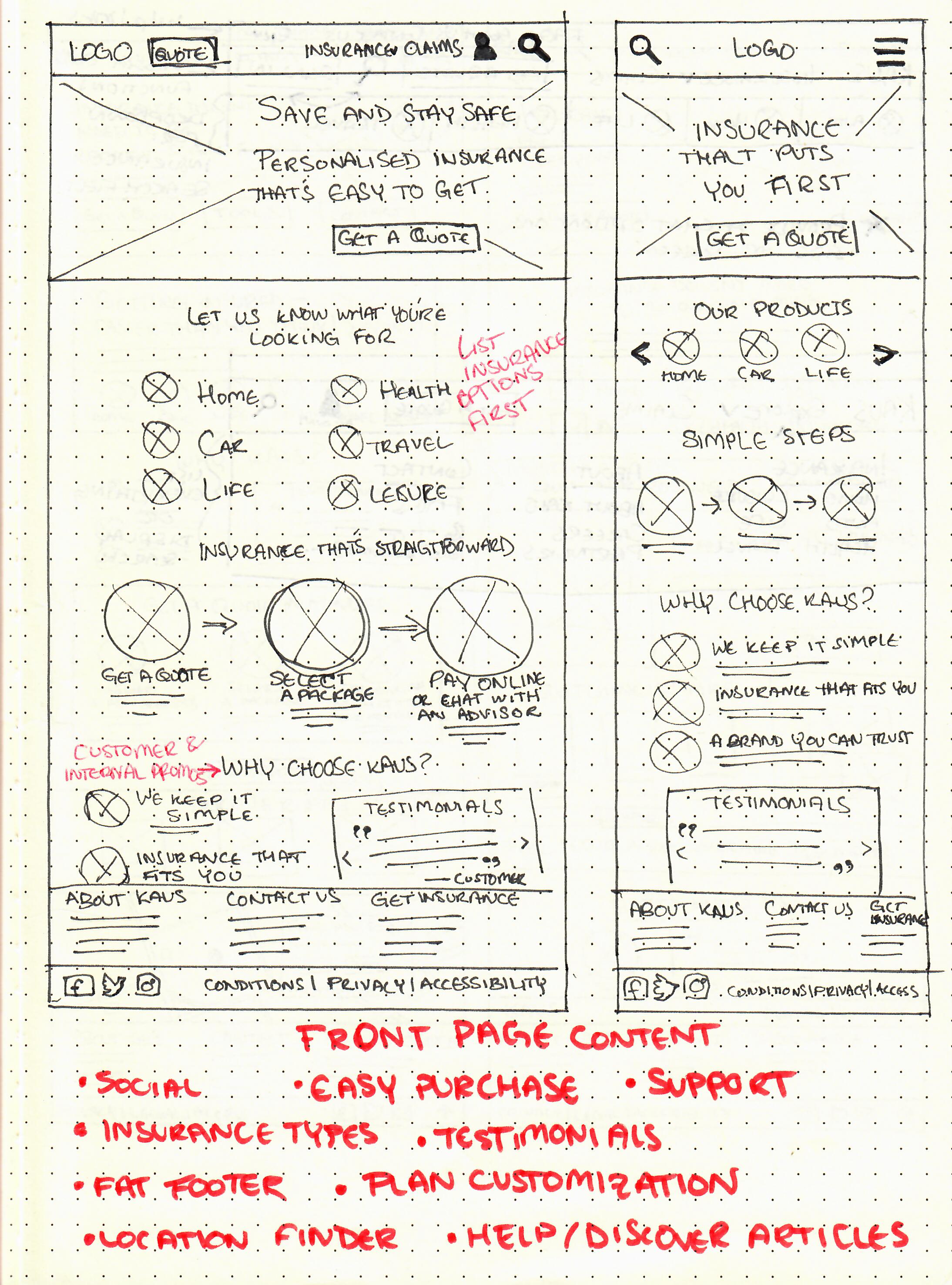
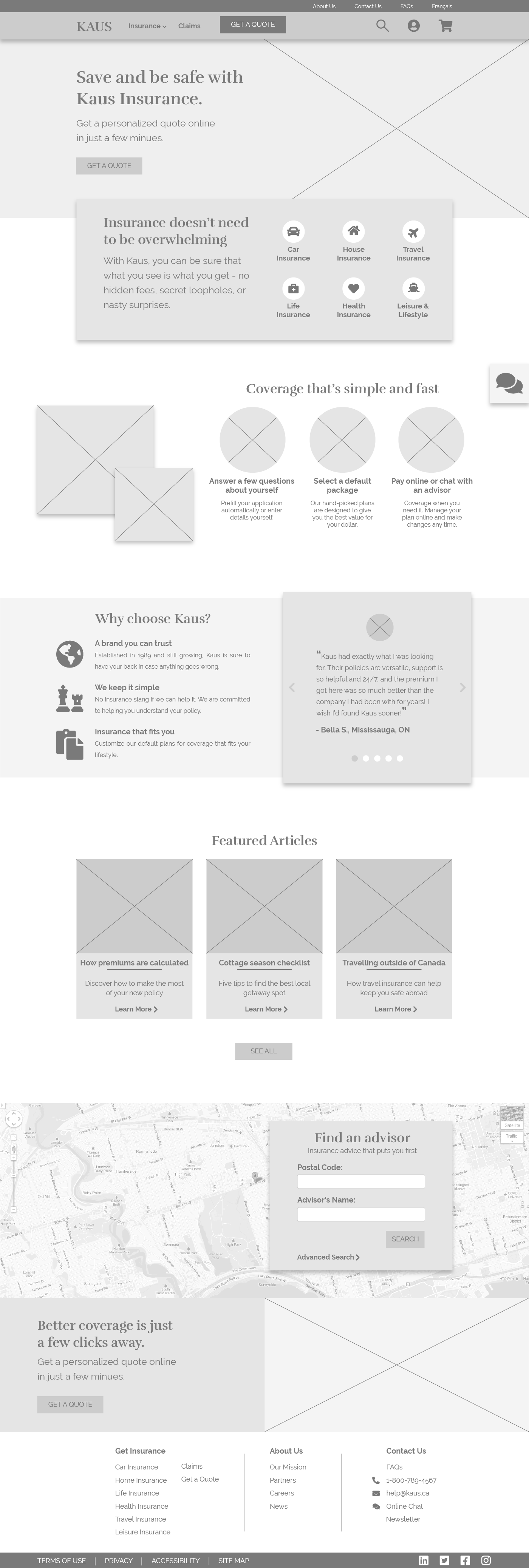
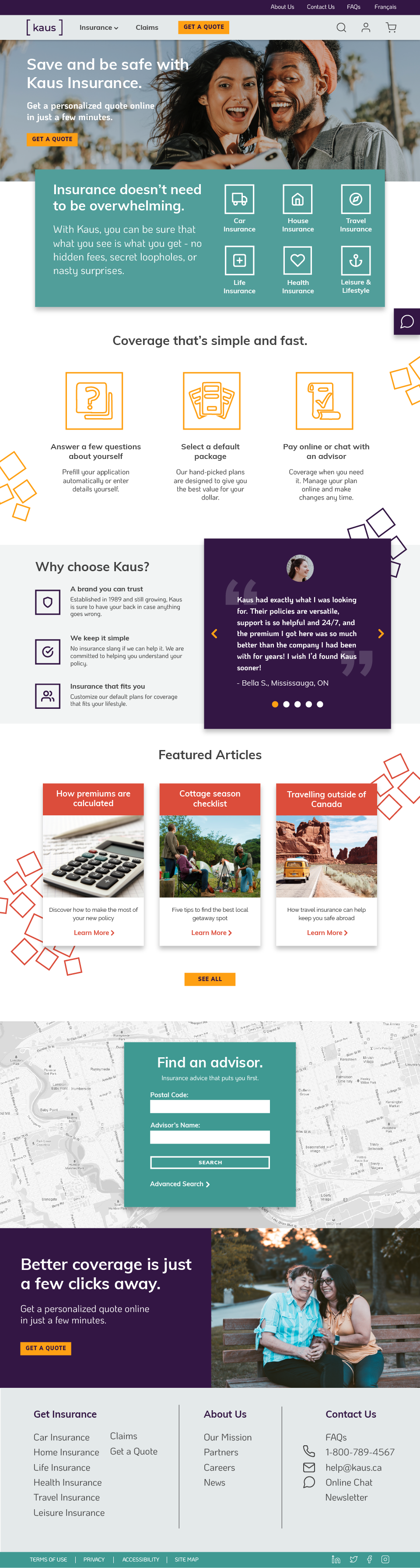
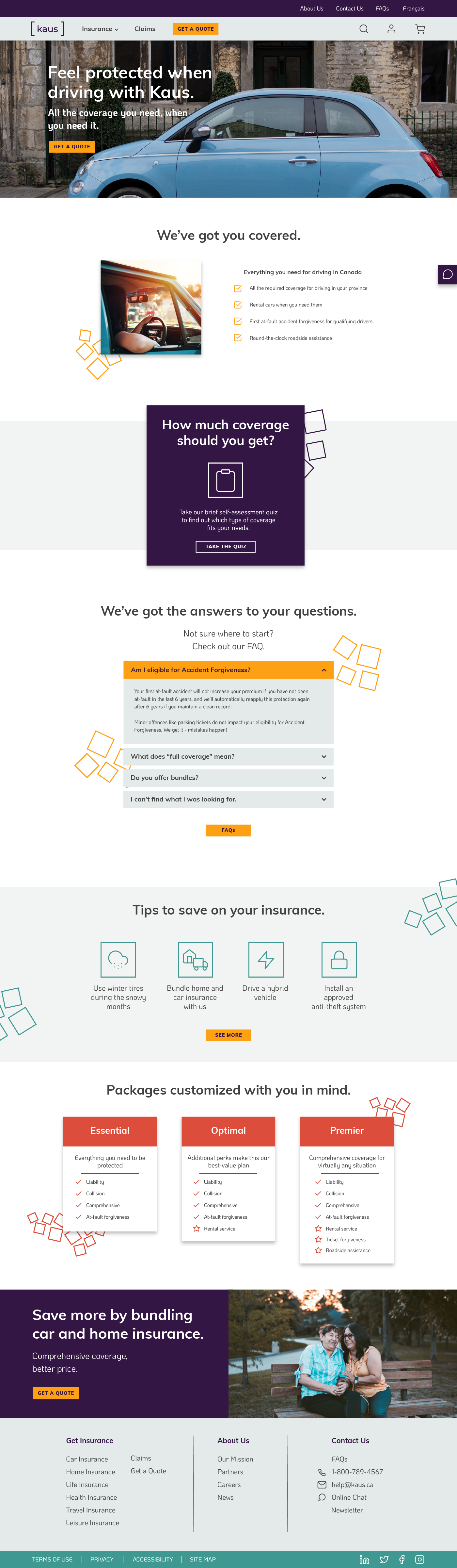
I began with sketching out concepts for the landing page: which sections to include, how to organize the navigation, different approaches to the layout. These were then refined into high-fidelity wireframes.
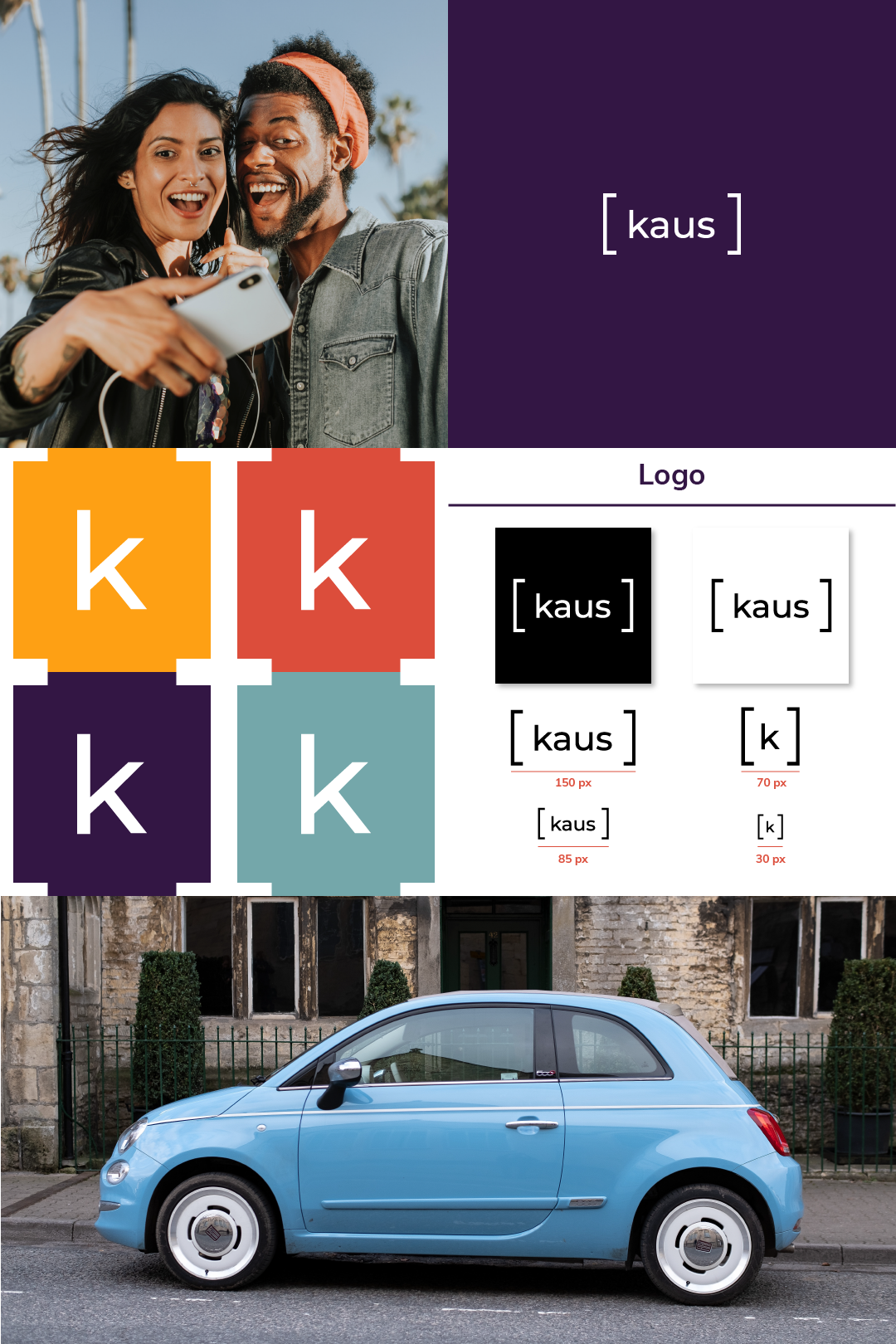
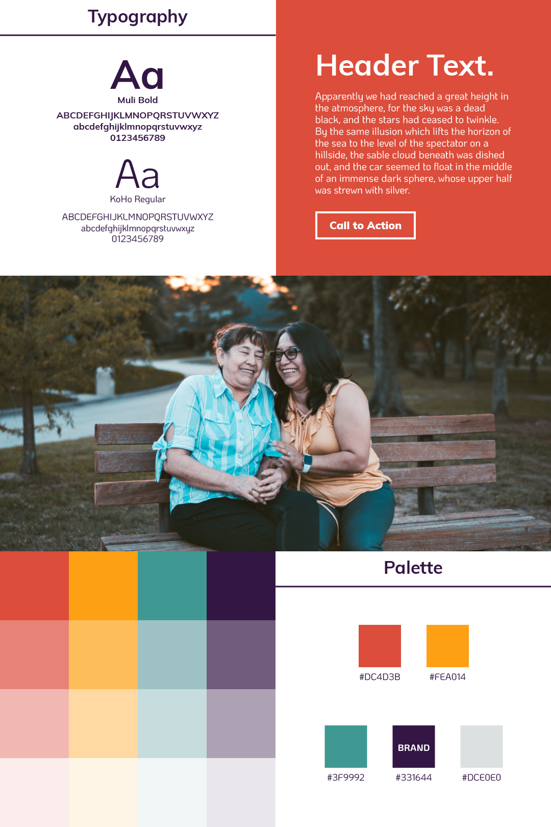
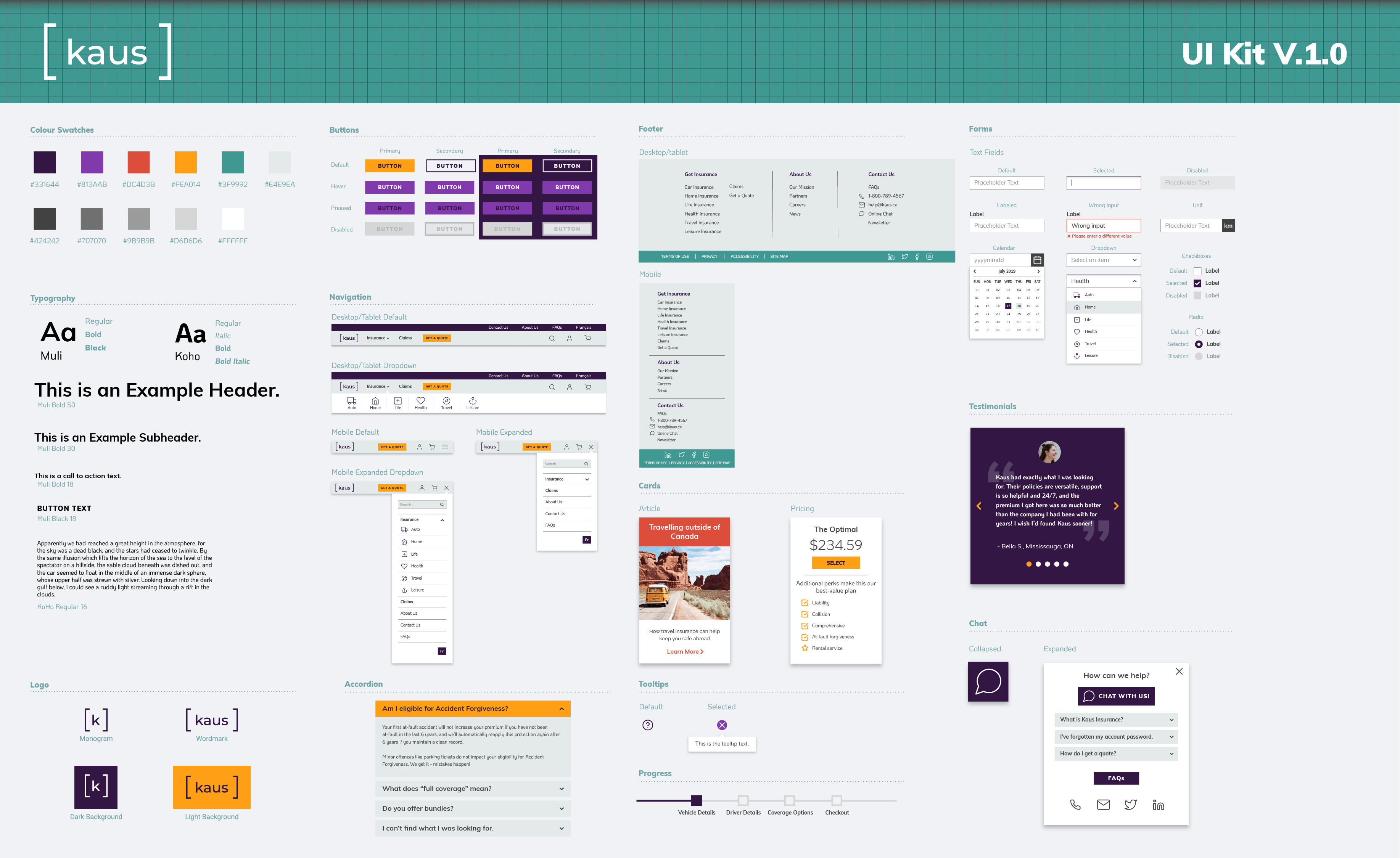
Based on Kaus' brief, the company wanted its brand to appear modern, fresh, and trustworthy. Keeping in mind these attributes, I designed a logo, style guide, UI kit, and a responsive homepage.
Sketching was a chance for me to figure out how the placement of different elements can be made to enhance the user experience.
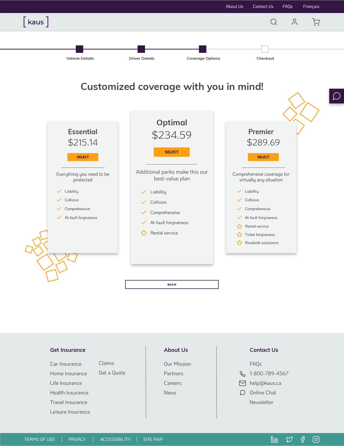
For example, the “Get a Quote” CTA is a core conversion criteria for Kaus. Including it in the hero section is attention-grabbing, and having it further down the page would entice users to click after they’ve learned a bit more about what Kaus offers.
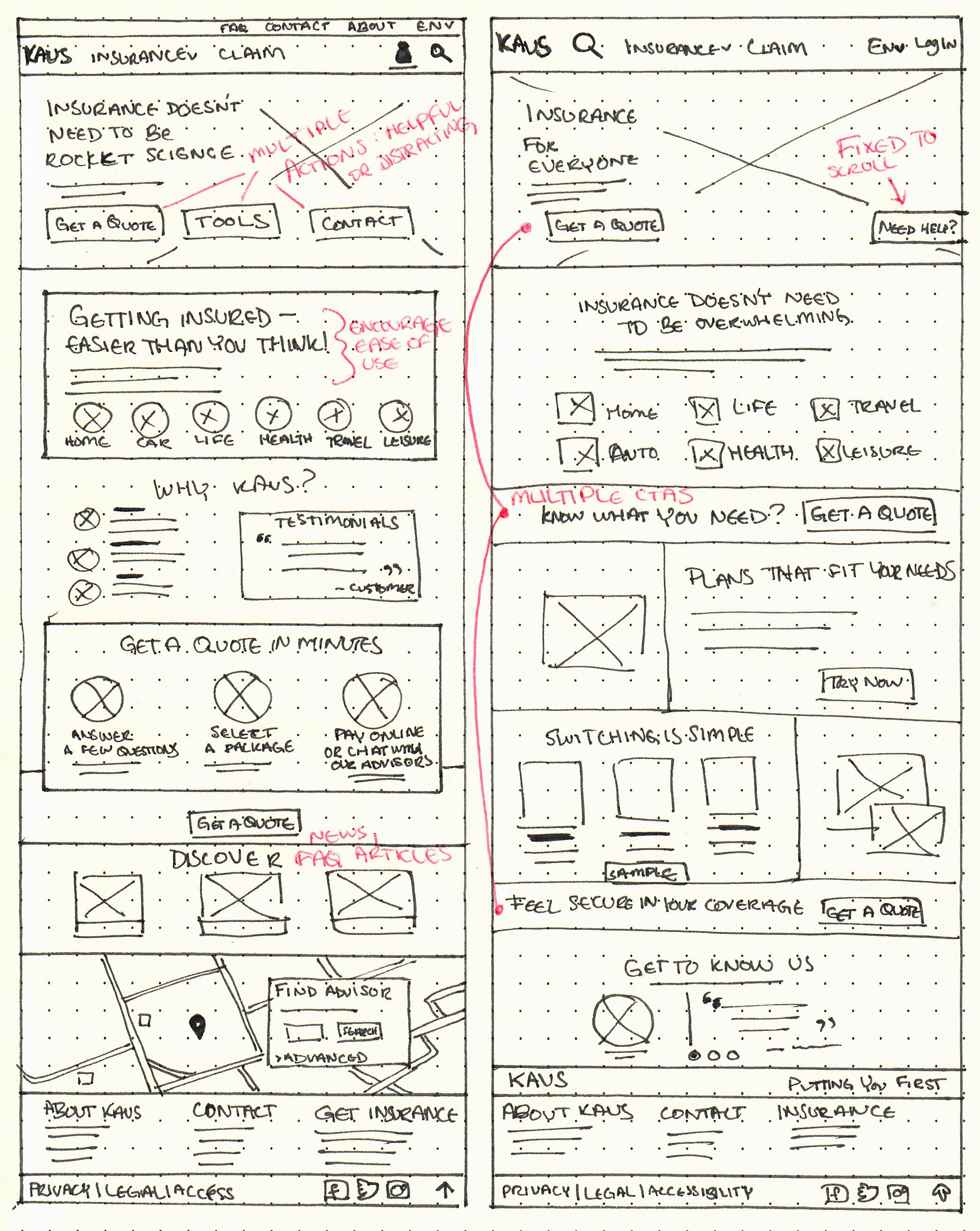
My wireframes were focused on layout and hierarchy. Overlapping planes tend to draw the eye naturally from one section to another, and icons helped to emphasize points of interest on the page.
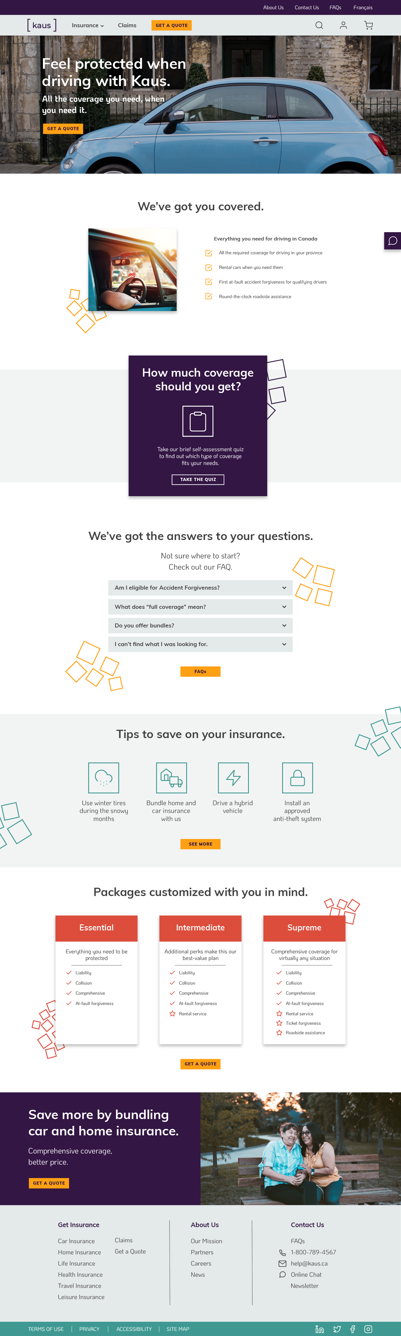
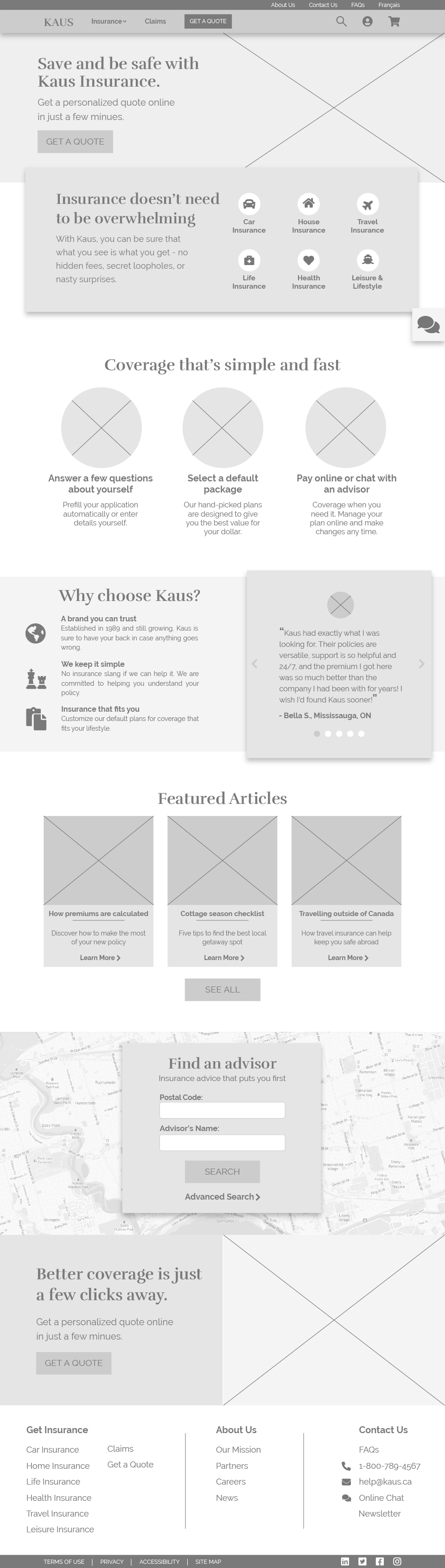
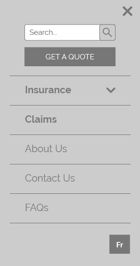
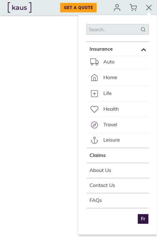
Ensuring that pages are responsive was also crucial. While the tablet version was quite similar to the desktop, the mobile version had to use different design patterns that were appropriate for the content in each section.

The logo design went through quite a few iterations before its final version. As per the company brief, it needed to evoke a sense of security, reliability, and be approachable to a younger demographic.
The final version of the logo is a relatively simple wordmark. The lowercase font is more approachable than some of the monograms I played around with, and the brackets around the word help evoke a sense of support and security.

My design patterns were centered around a bright, contrasting colour palette. I chose a dark purple as the brand colour because it was quite different from brand colours used by competitors, as well as being accessible when set against a light background.
The rounded, friendly font types were contrasted with the sharp edges of other elements, such as form boxes and buttons. While Kaus wants to be fresh and approachable, it’s also important to feature the stable and reliable nature of the brand.


With the design direction established, it was time for me to create a prototype of the site and put it in the hands of users.
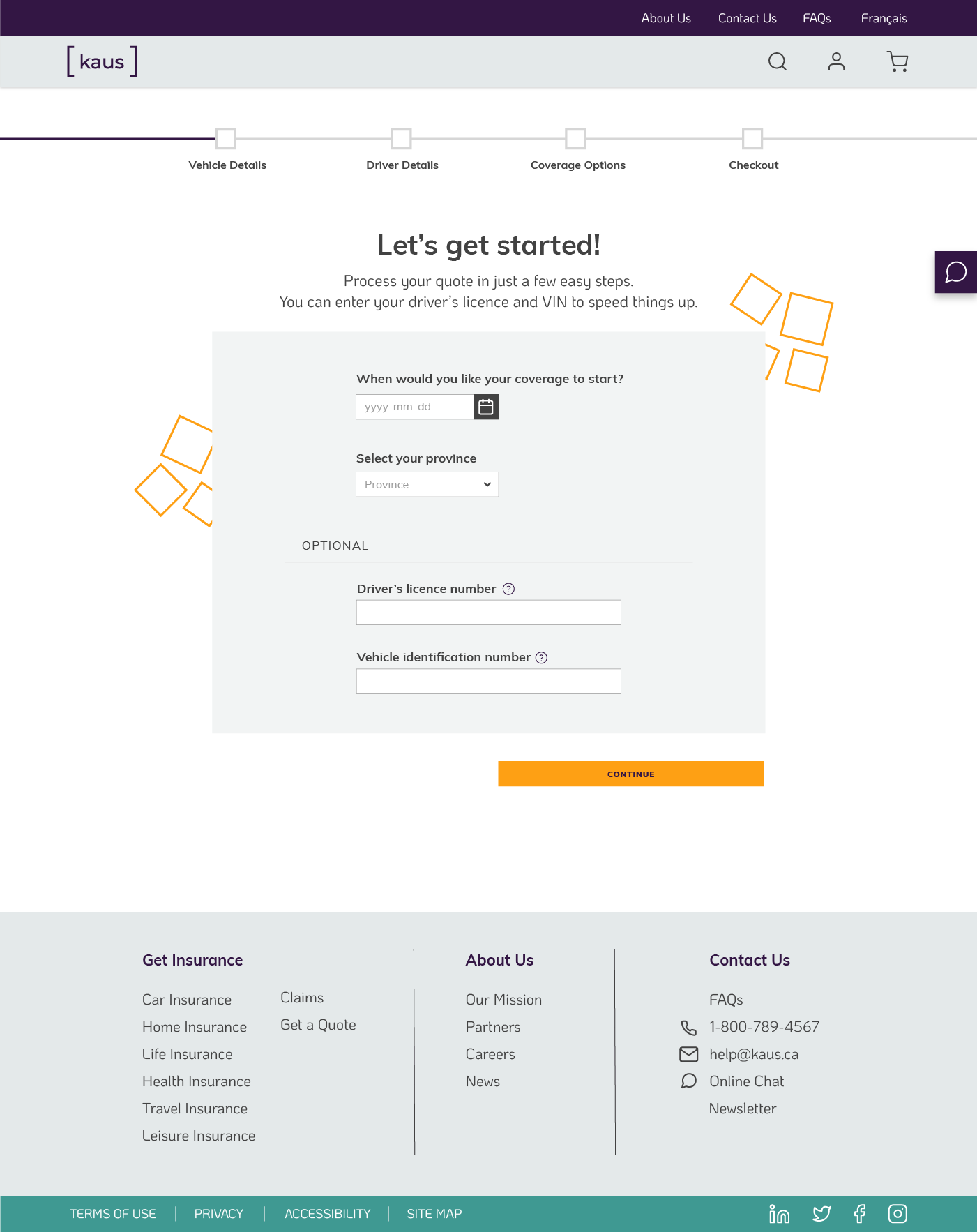
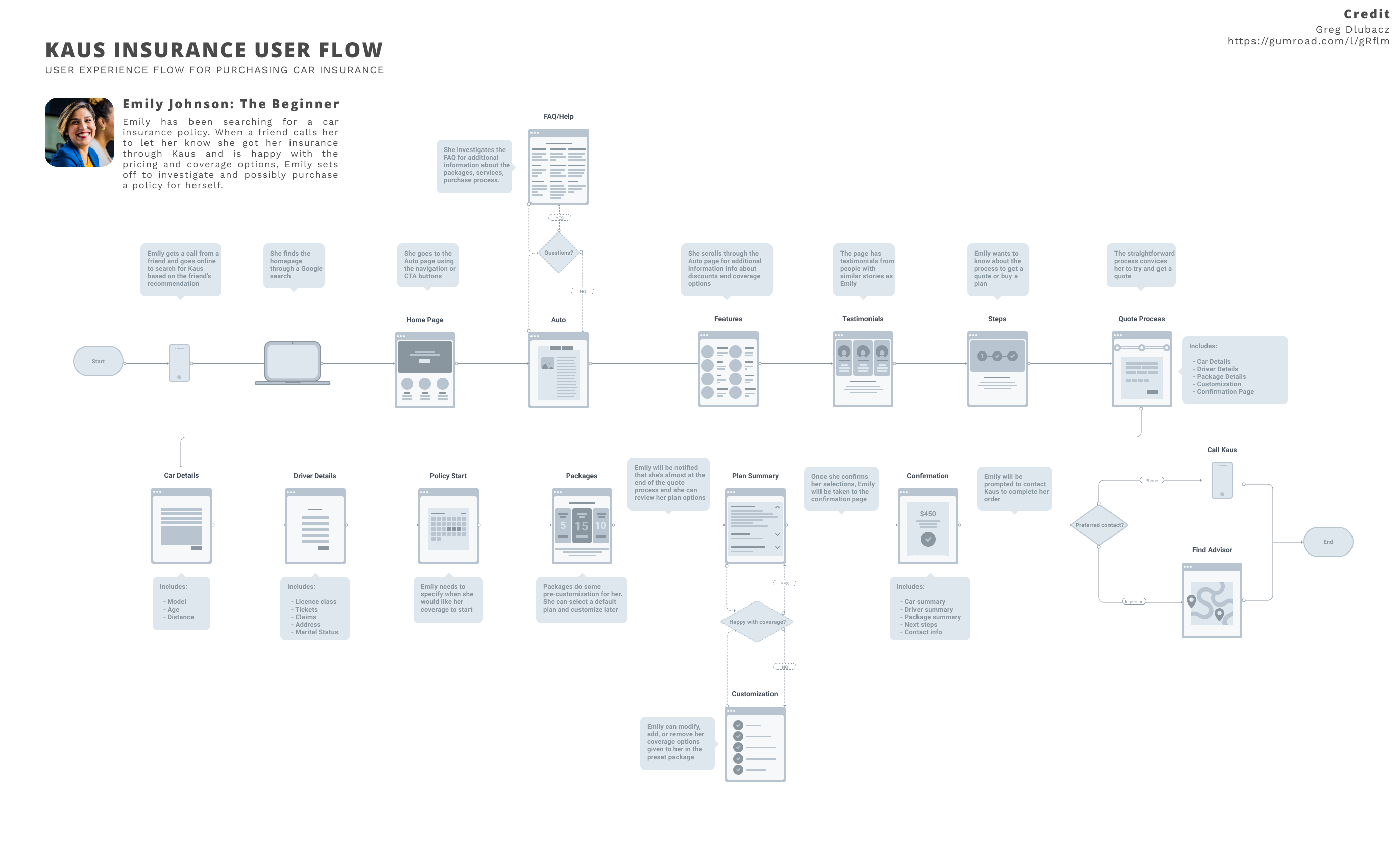
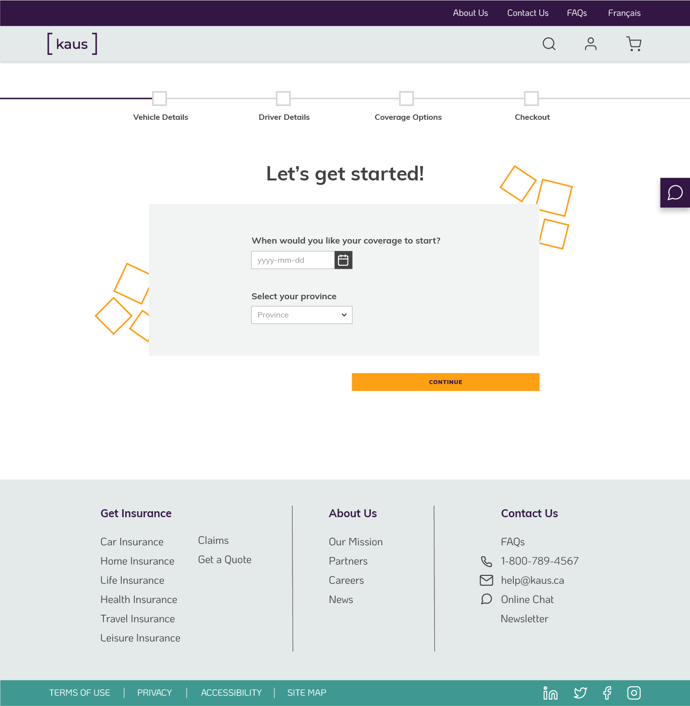
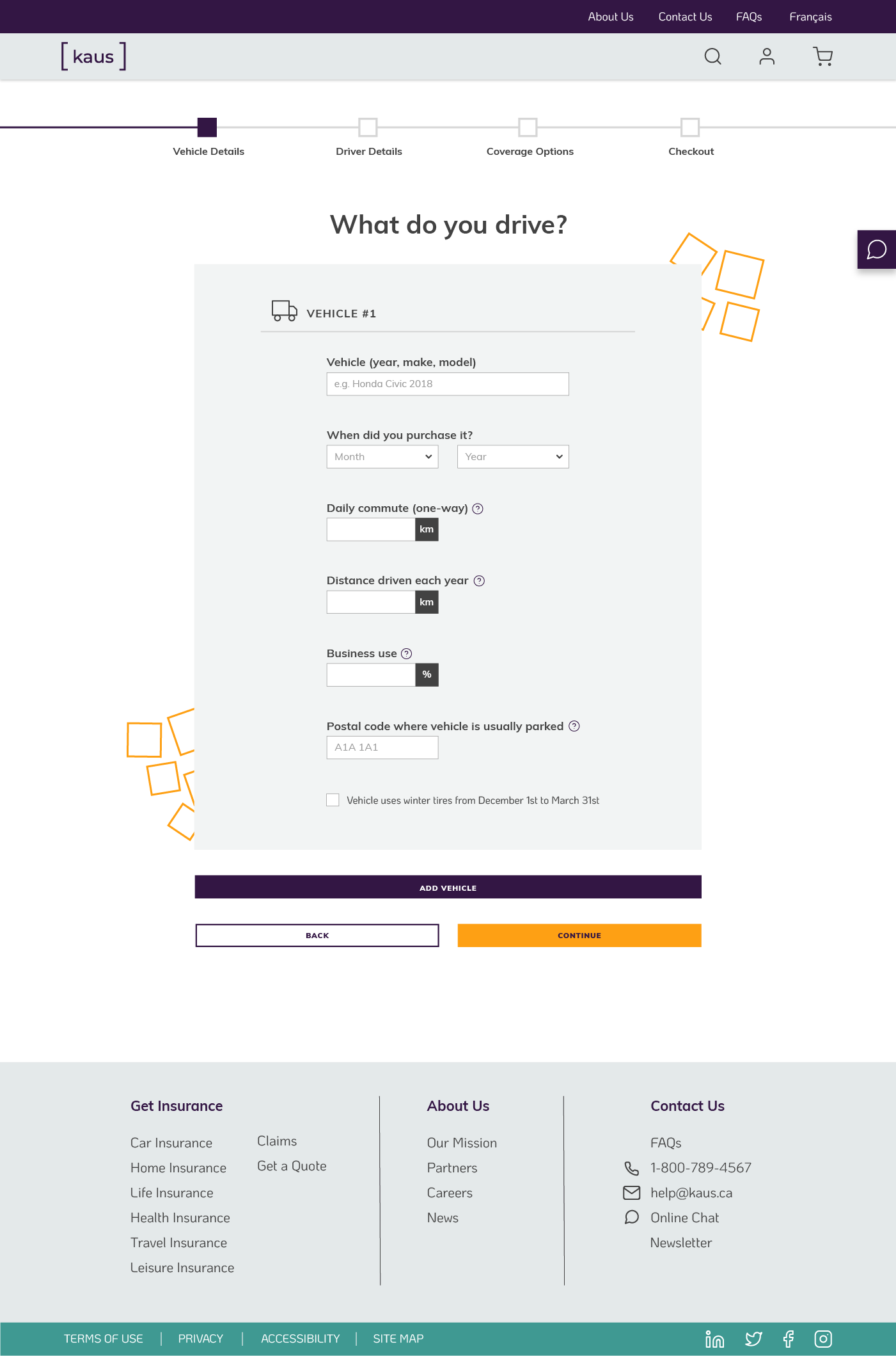
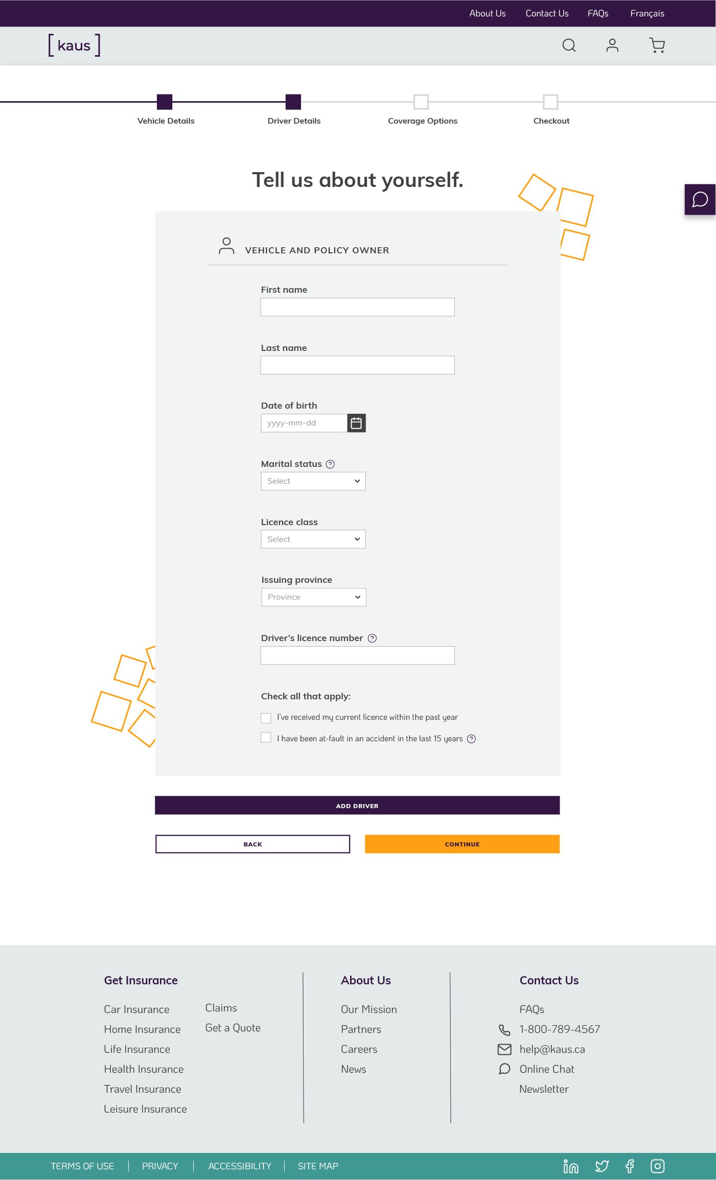
While Kaus offers a variety of insurance types, car insurance was the most familiar to the target demographic. I decided to focus on two main flows for car insurance in my prototype:
After conducting usability testing, I created an affinity map of high points and frustrations of the users. This let me organize the feedback I received to ensure I would implement the highest-priority revisions first.
Users were asked to perform the following tasks:
The first task was designed to see what the users thought about casual browsing and the main content of the site, any likes or dislikes about the presentation of text, images, and navigation.
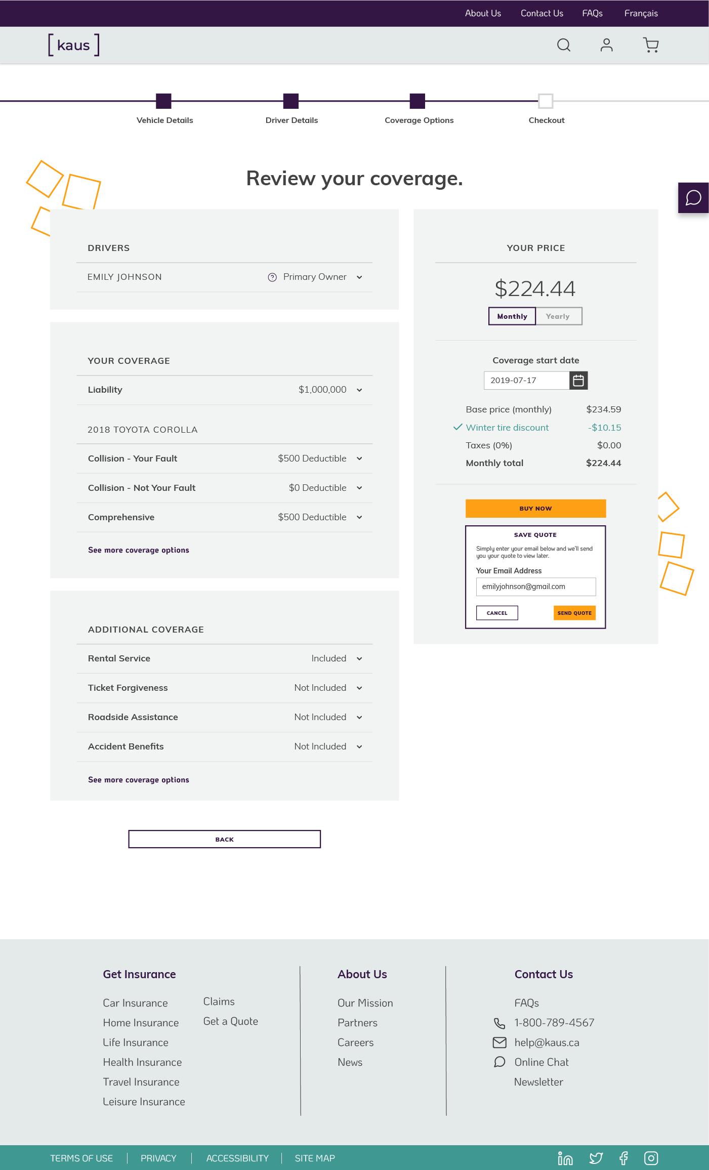
The second task involved progressing through forms and reviewing detailed information. It’s an opportunity for users to point out if the flow and presentation of information made sense and if anything was missing or misleading.
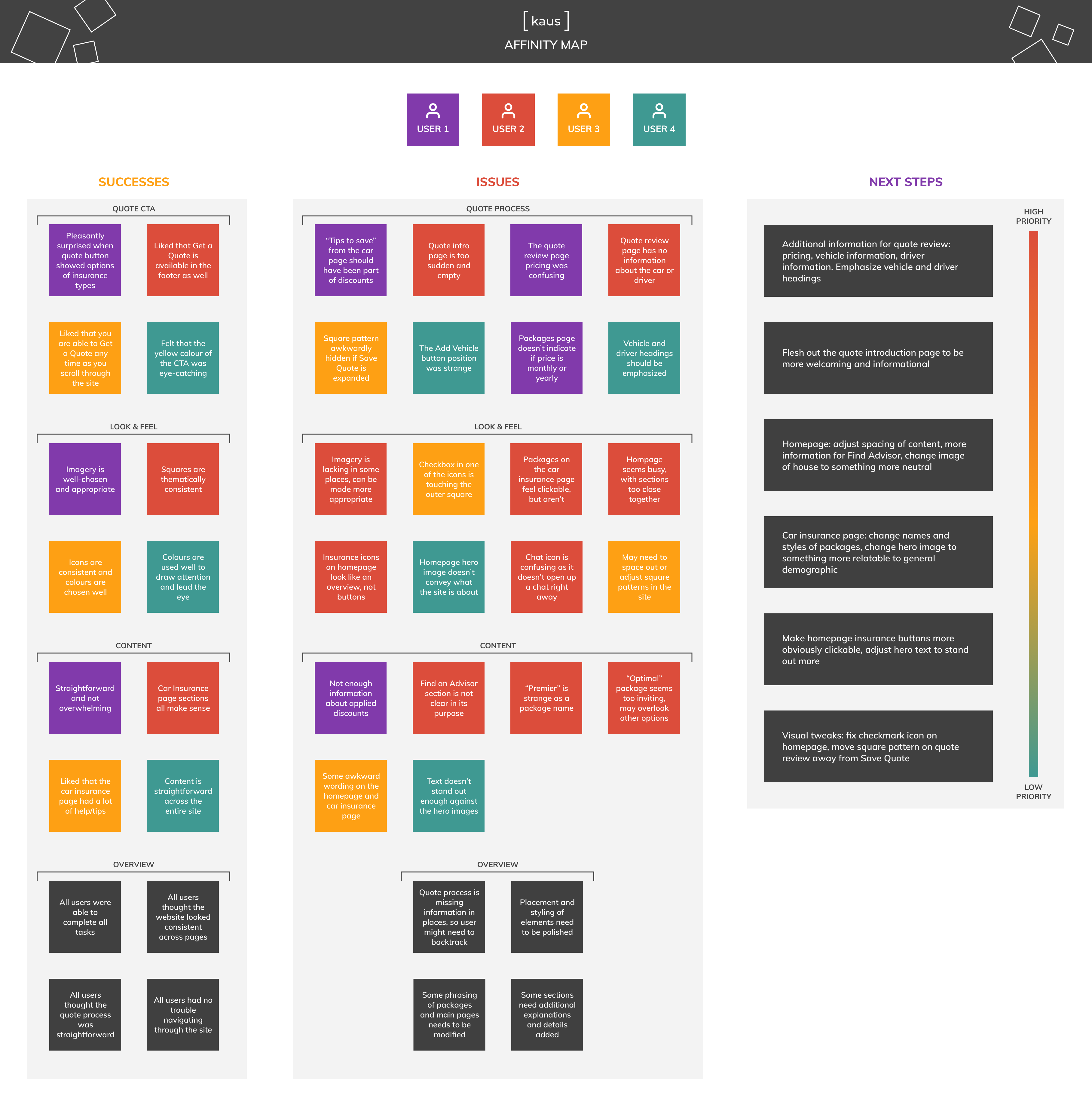
Users had no issue with navigating around the site, thought the quote process was straightforward and that the site looked consistent across all pages. CTAs were eye-catching and readily available, tips and explanations were helpful, and imagery and colours were used appropriately.
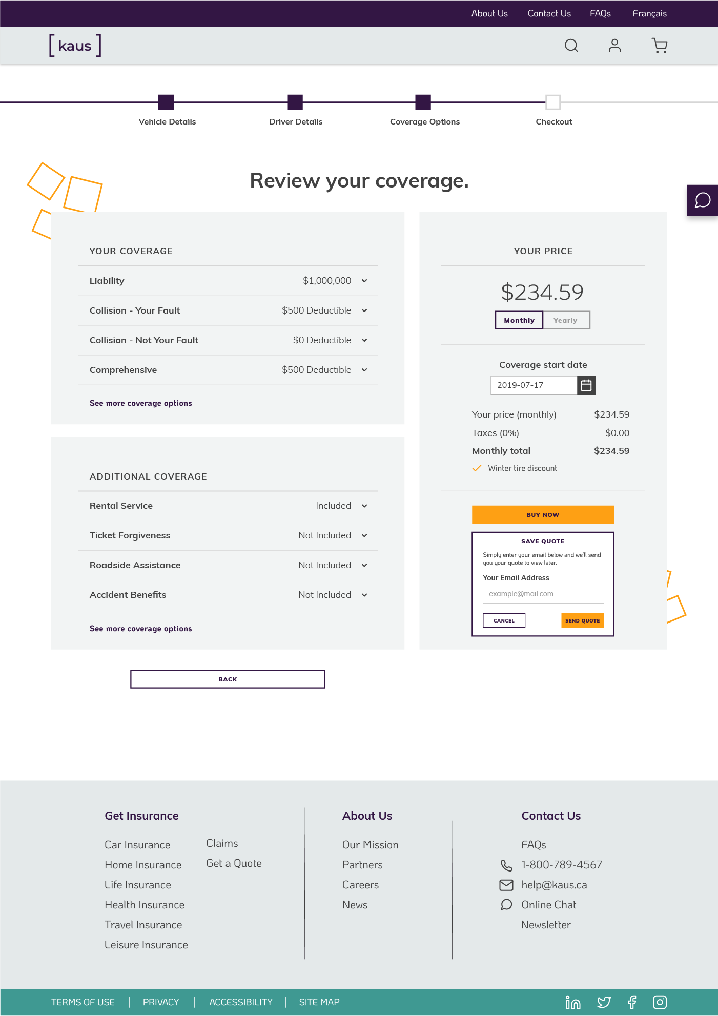
Thanks to my participants, I was also able to note areas of improvement. It's vital for Kaus to be transparent about what it offers, and a few areas of the site could have used more clarification. In particular, the quote summary needed to include information about the drivers and vehicles, to avoid users having to backtrack through their application.
After evaluating the results of the usability testing, I prioritized the items I could accomplish within my timeline. I updated the prototype with the following:
Added more information to the quote review page, adjusted display of pricing.
Modified landing and car insurance pages with more appropriate wording and imagery.
Updated icons and background patterns to fix positioning and display issues.